All cases / Canelé.lt
2024
An online shop for a family canelé bakery
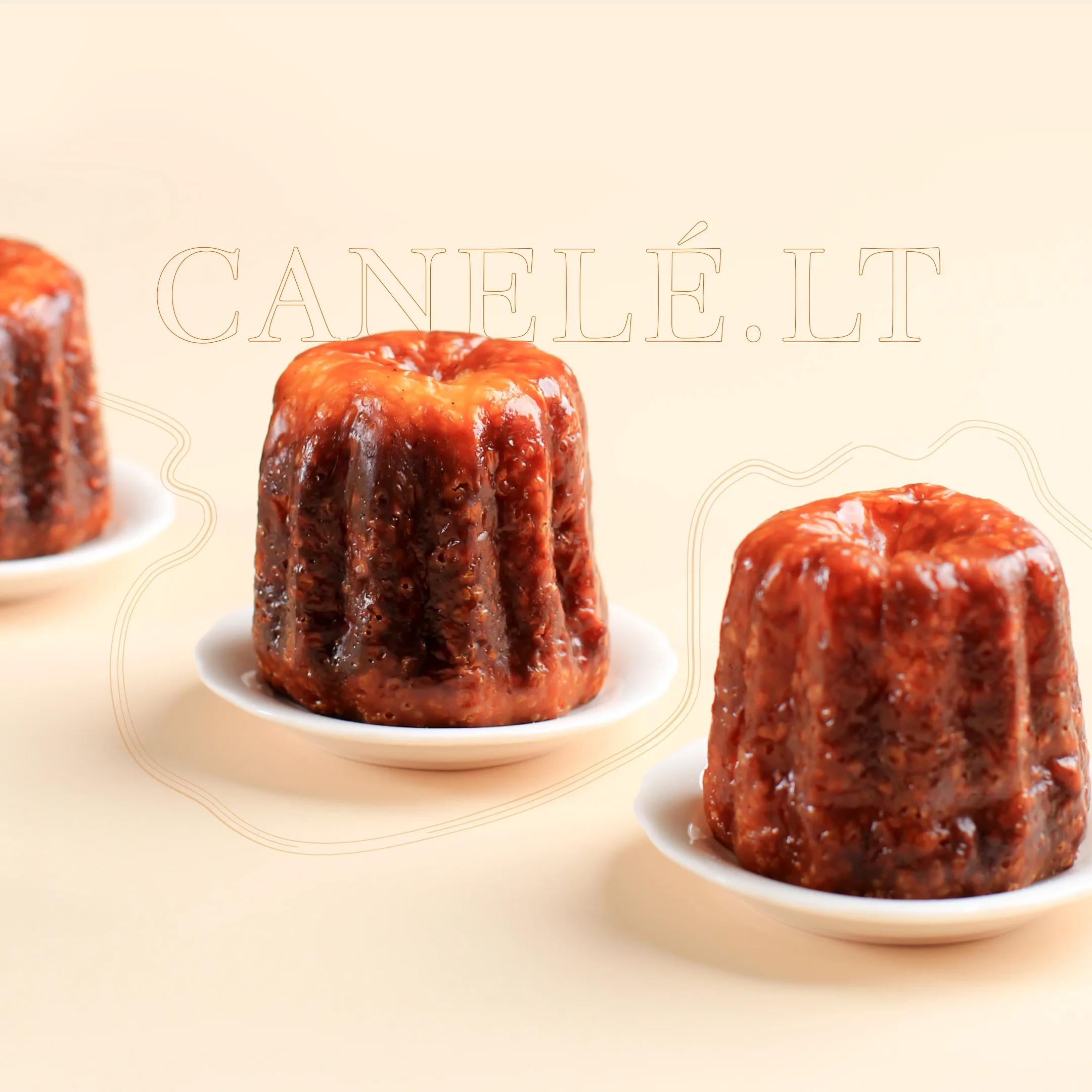
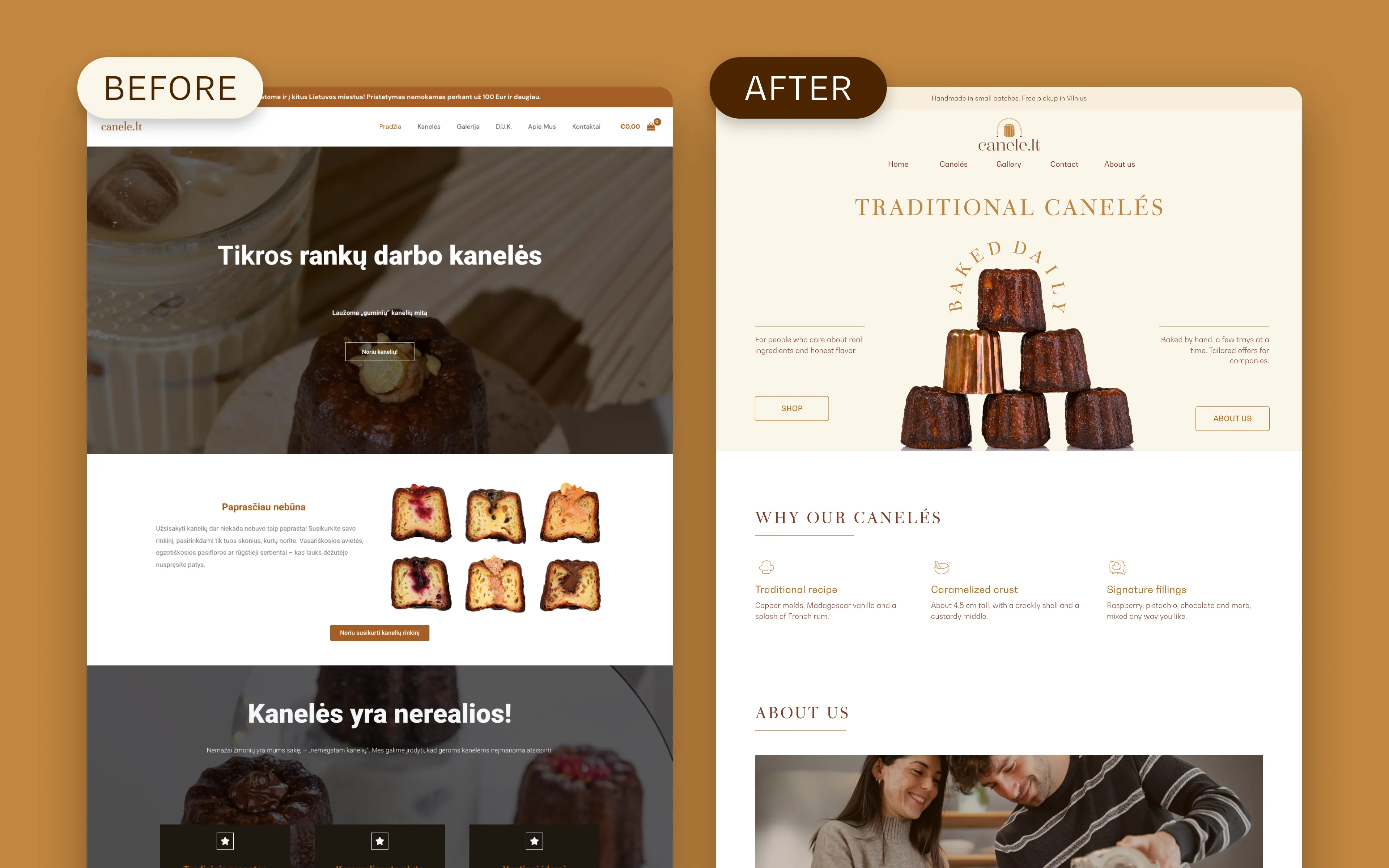
Canelé.lt bakes Bordeaux canelés by hand in Vilnius. We redesigned its look, product photos and online shop, so people can comfortably pick fillings and order a box in a few steps.
Client
Canelé.lt
Industry
Food, premium confectionery
Year
2024
Timeline
1 month
Role
Art direction, UX/UI design
Live site
Visit siteOne pastry, made by hand
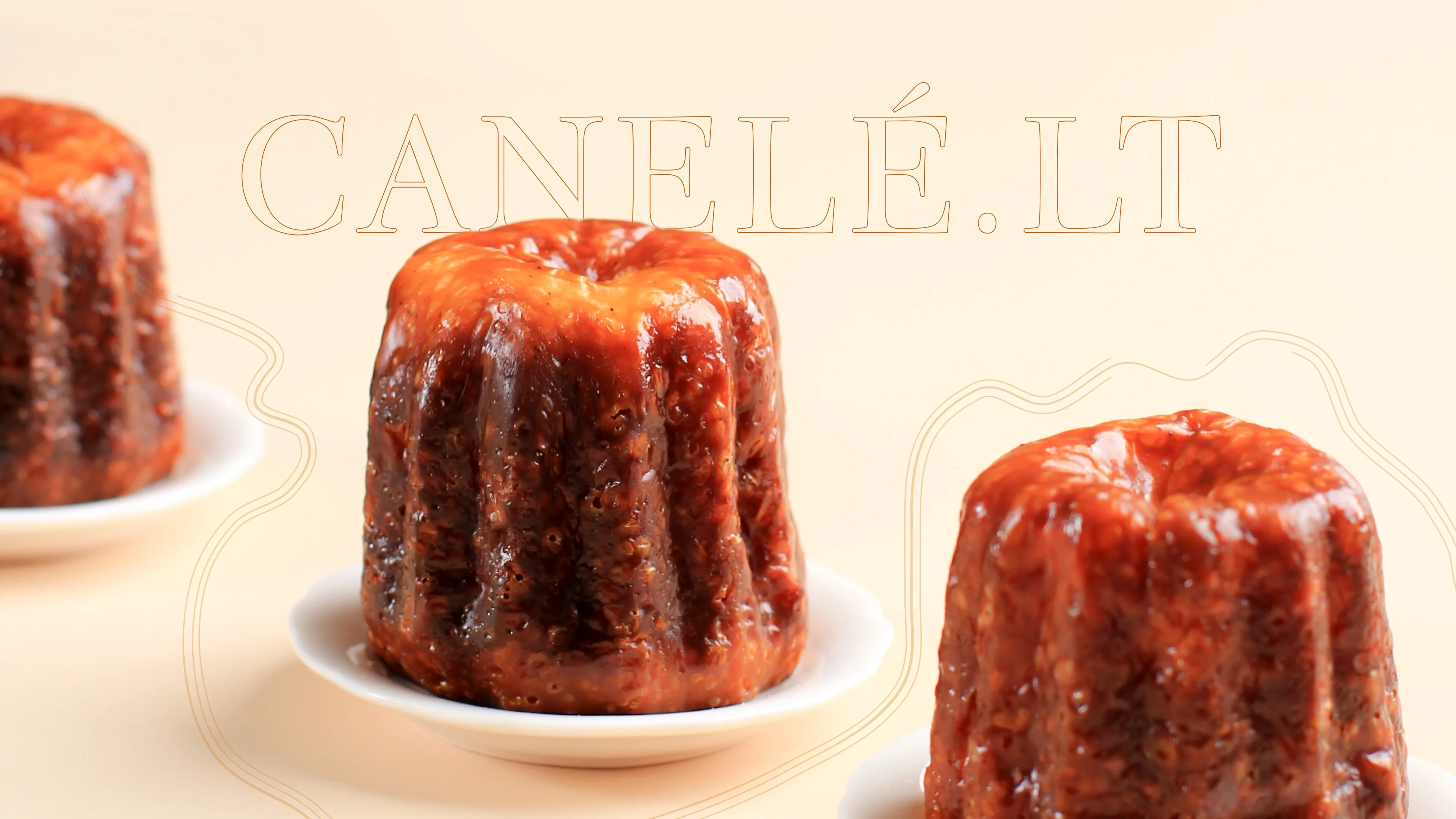
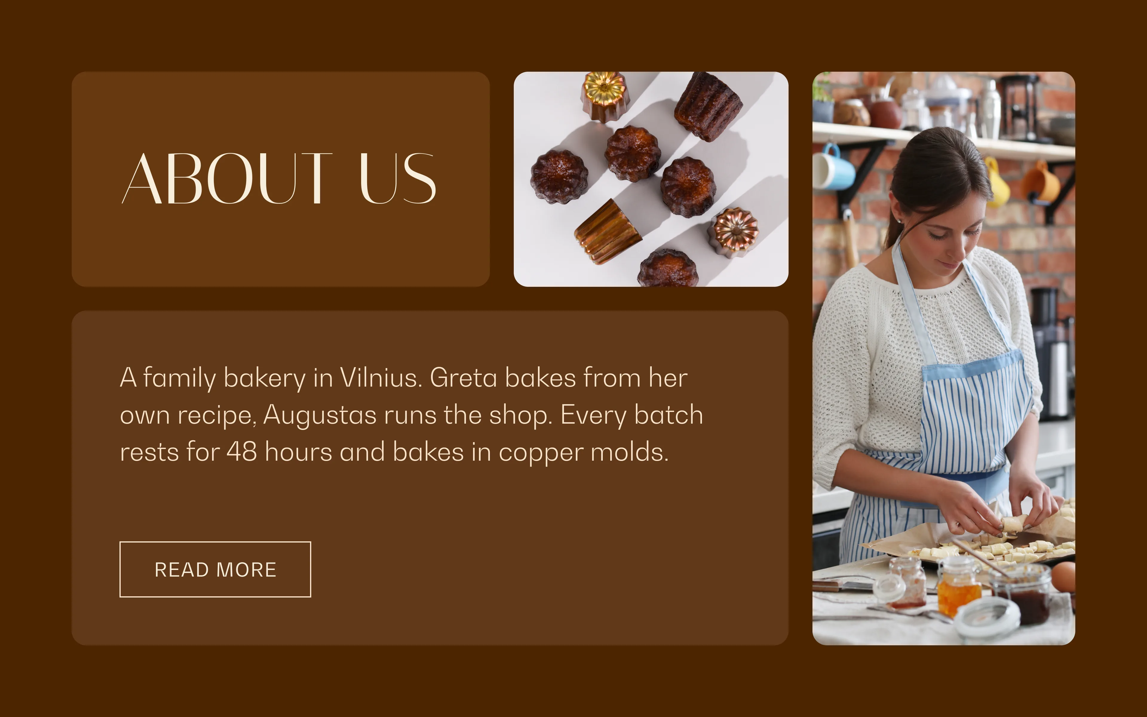
Canelé.lt is a small family bakery in Vilnius, Lithuania. They bake a single French pastry, the canelé: a dark caramelized shell around a soft vanilla and rum custard, baked in copper molds.
The old site didn't show any of that. It used mostly stock layouts, small photos and long blocks of text, which created a wall between people and the order button. We set out to let the pastry carry the page.
Colors taken from the pastry
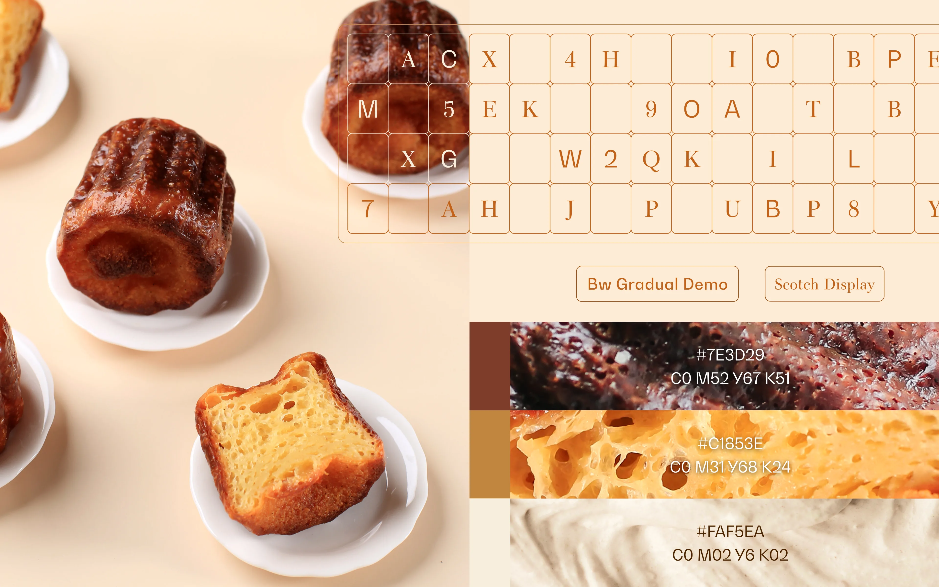
The palette comes from a cut canelé: the deep brown of the caramel shell, the golden custard and the cream. Each color got a texture swatch, so the brand reads as food before it reads as a website.
Scotch Display, a high-contrast serif, sets the headings and the outlined display lines. Bw Gradual, a calm geometric sans, carries product names, prices and body text.
One look for every flavor
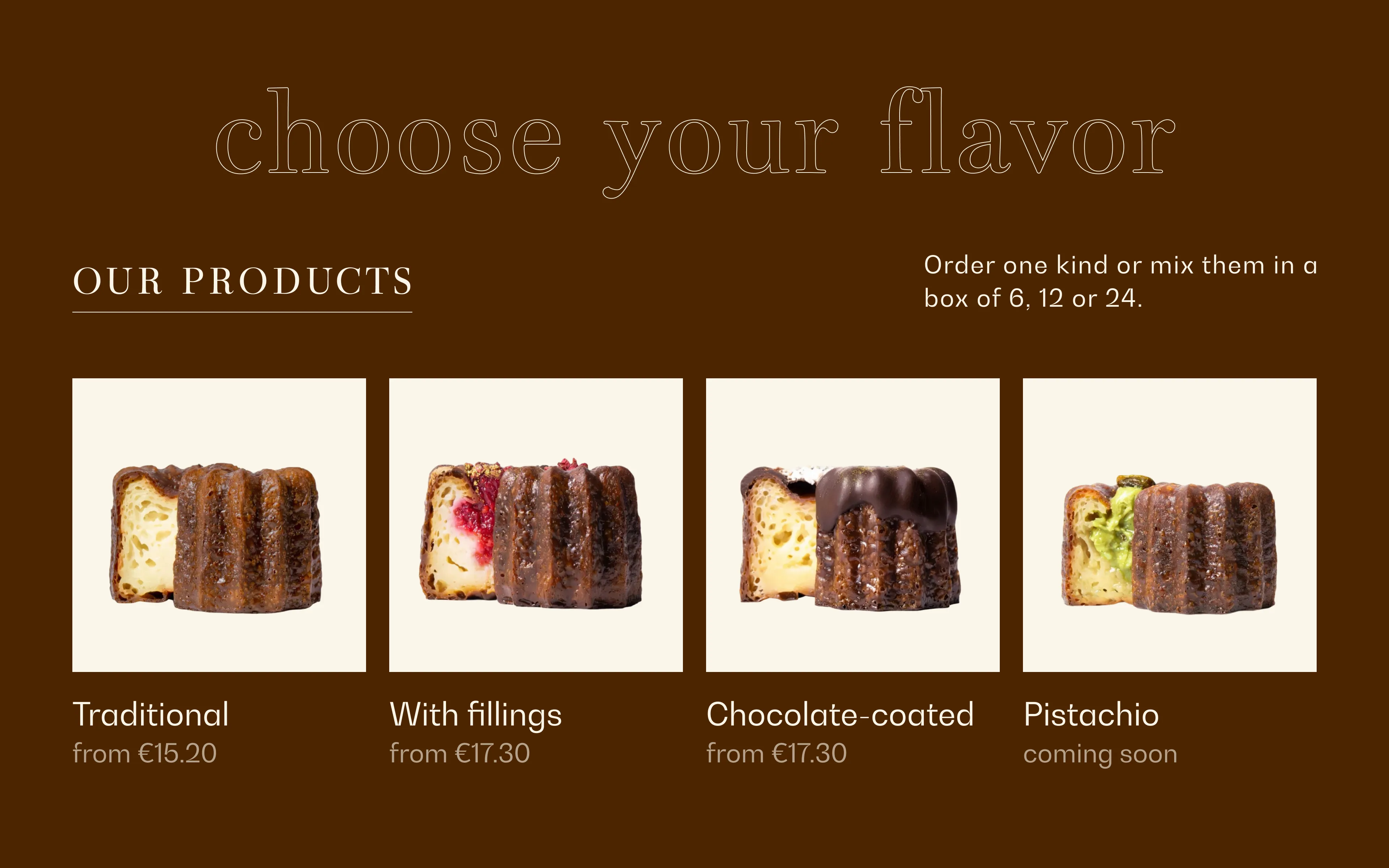
The bakery's photos came from different shoots, with their own light, background and framing. Side by side, they looked like products from different shops.
We took every canelé and set it on the same clean card, at one scale and one baseline, keeping the real crumb and glaze. A new flavor now needs a new photo, not a new layout.
Pick the fillings and the box
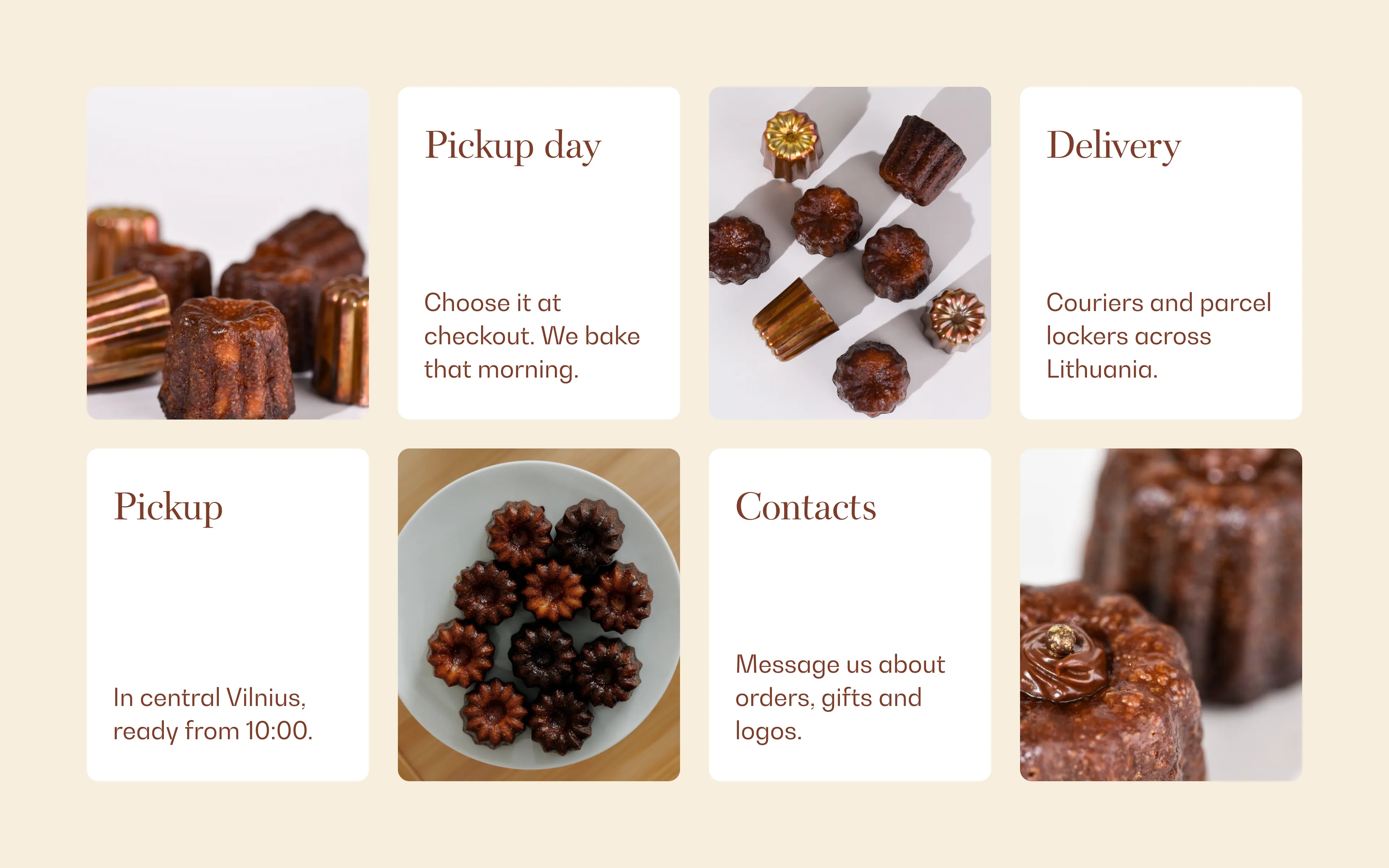
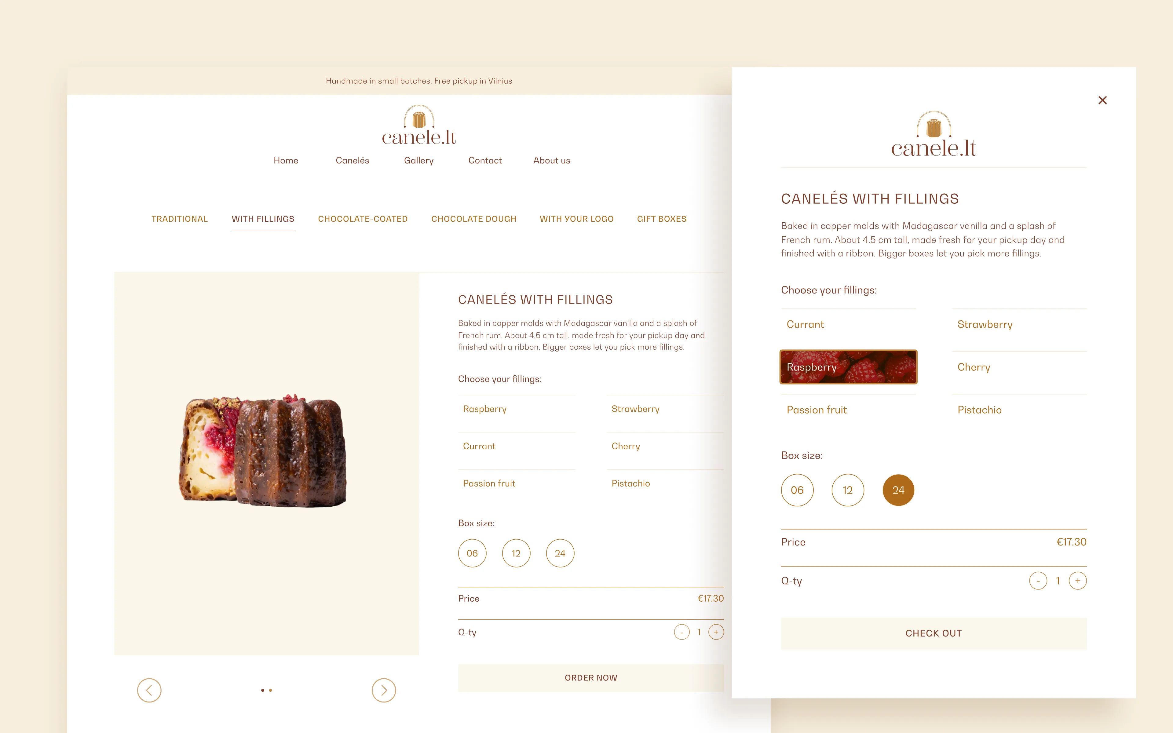
People order canelés by the box, so the shop is built around that. Categories sit at the top of every product page. Fillings are simple choices, boxes come in 6, 12 or 24, and the price updates as you go.
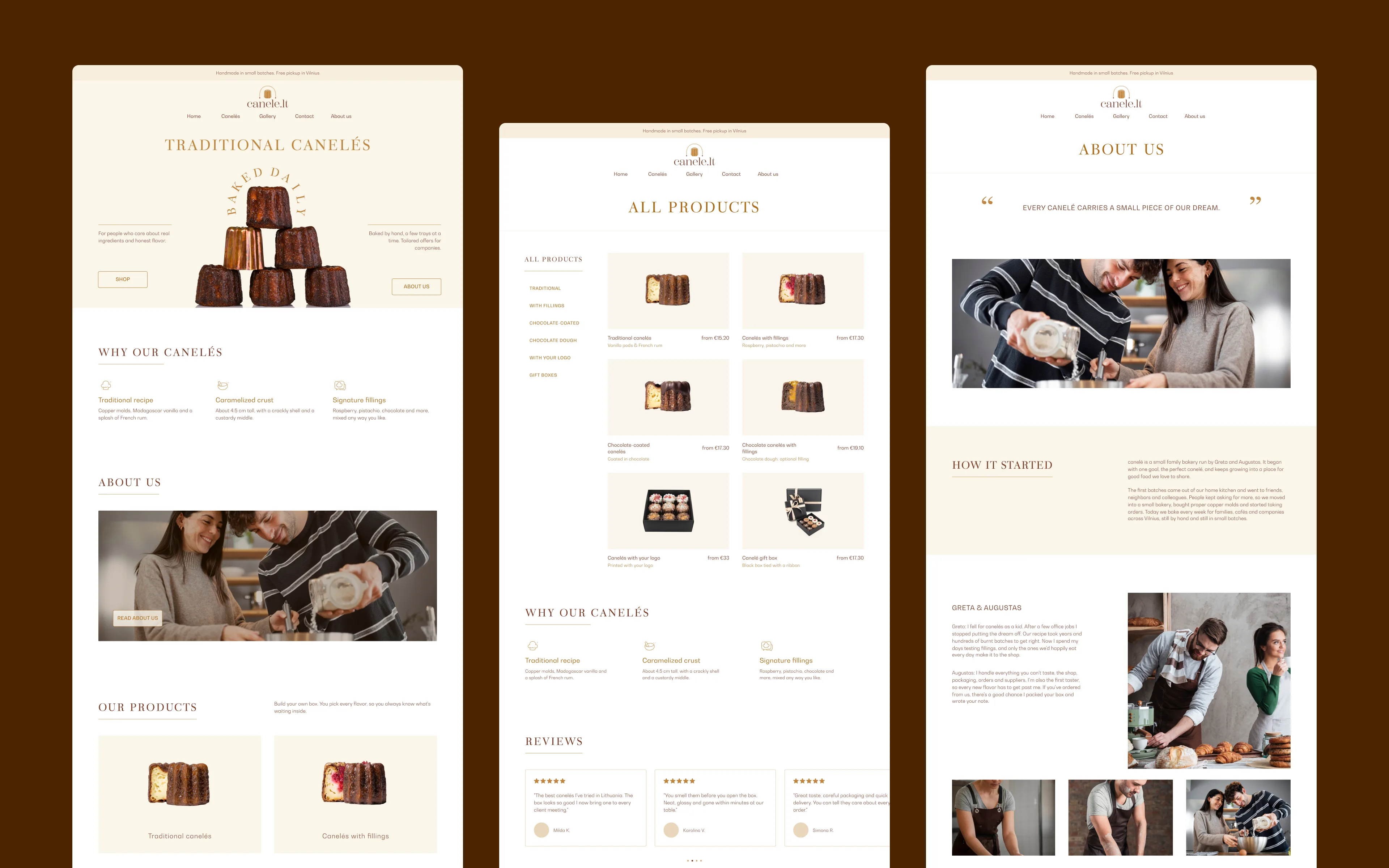
Checkout opens in an overlay, so the product stays in view. Home, catalog and About us share the same cream cards, thin rules and outlined headings.
The same shop on every screen
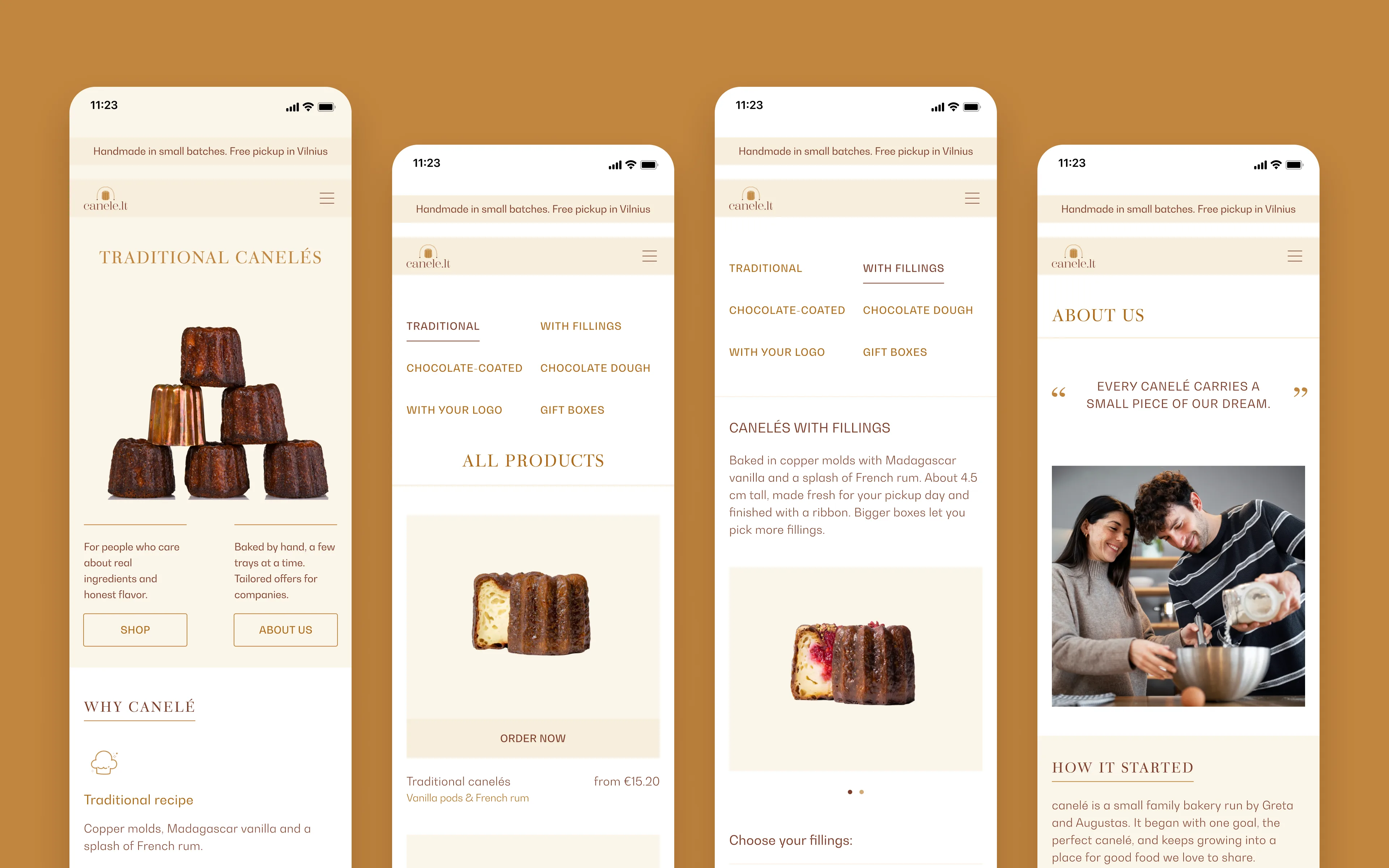
We designed 16 screens for desktop, tablet and mobile. On phones, categories turn into a two-column grid, every product card gets a full-width order button and the menu folds into the header.
Got a website
to build?