All cases / Kodiia
2021
3D made friendly for beginners
Kodiia teaches people to build with 3D assets. We designed a new logo and refreshed the app for desktop and mobile.
The goal
Kodiia is a web app that teaches people to work with 3D assets. Most of its users are new to 3D. The old design made the product look harder than it is.
Our job was to make it feel lighter and more welcoming to beginners. It runs in the browser on desktop and mobile, so the design had to work on both.
Logo design
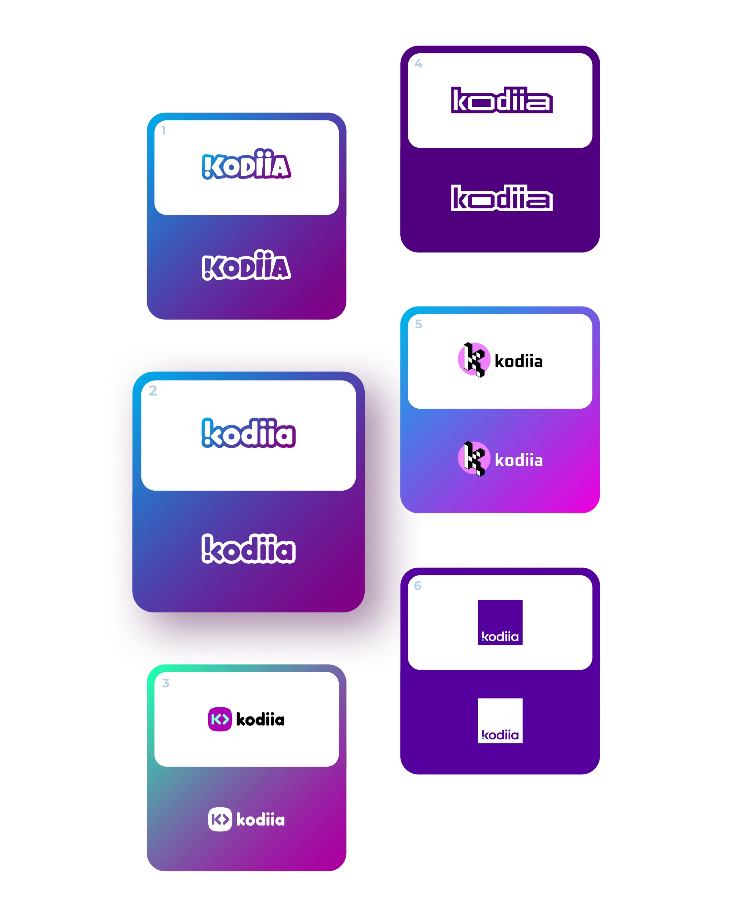
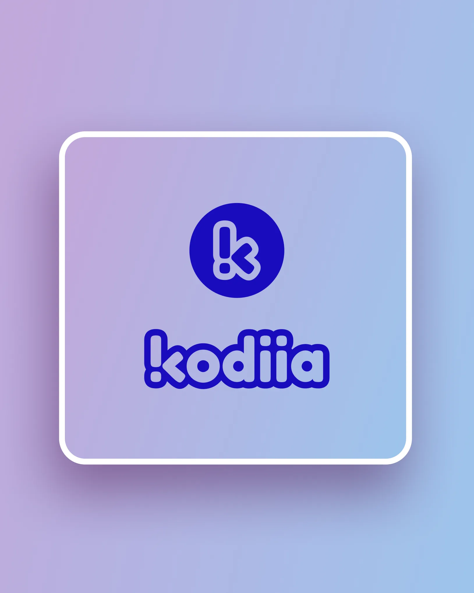
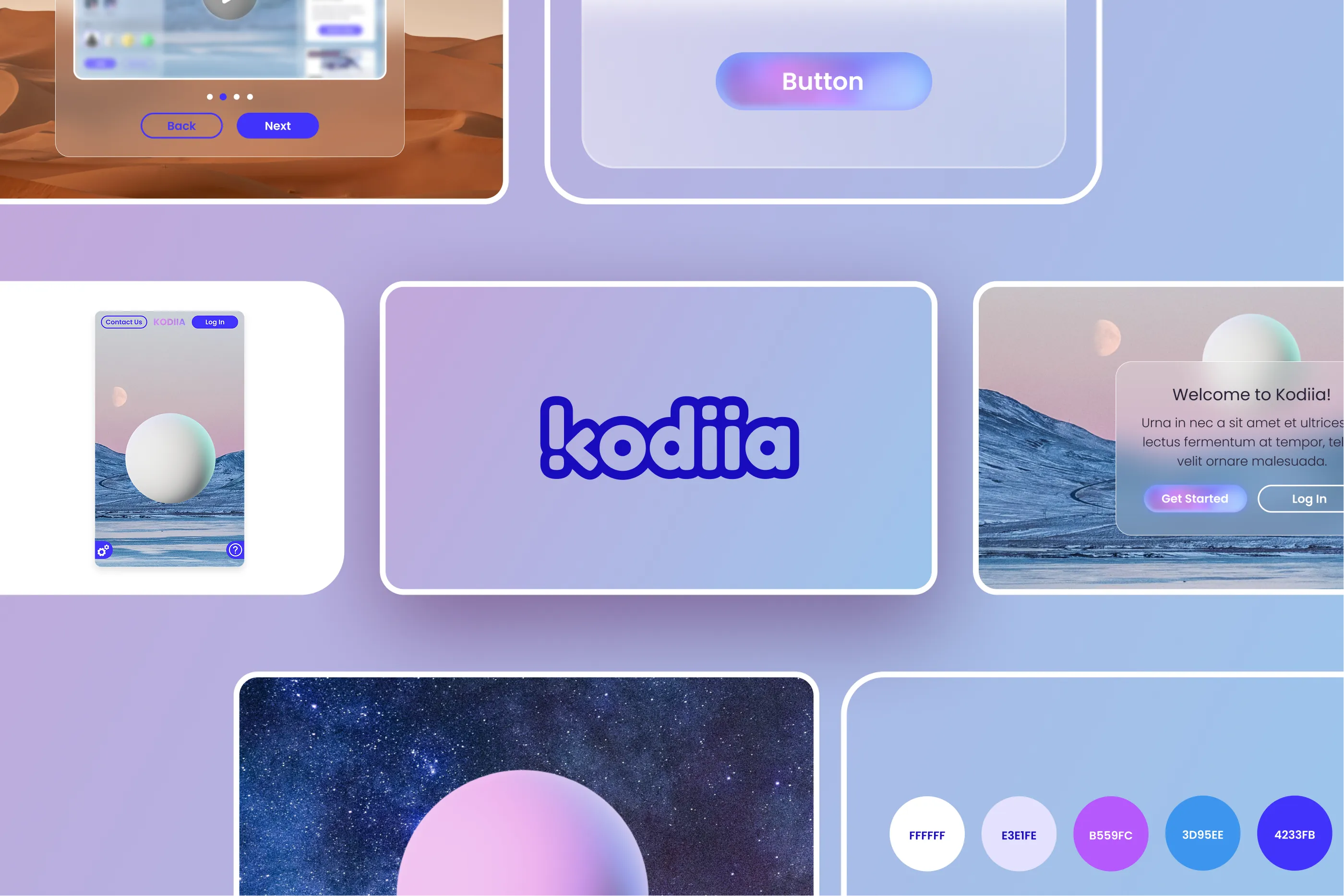
Kodiia needed a new logo in its brand colors. The symbol is a K built from an exclamation mark and an angle bracket. One half is playful, the other technical, like the product.
We presented six versions, and the client chose the second. It stayed readable at app-icon size, and its rounded corners matched the soft, friendly interface we were designing.
Typography and color
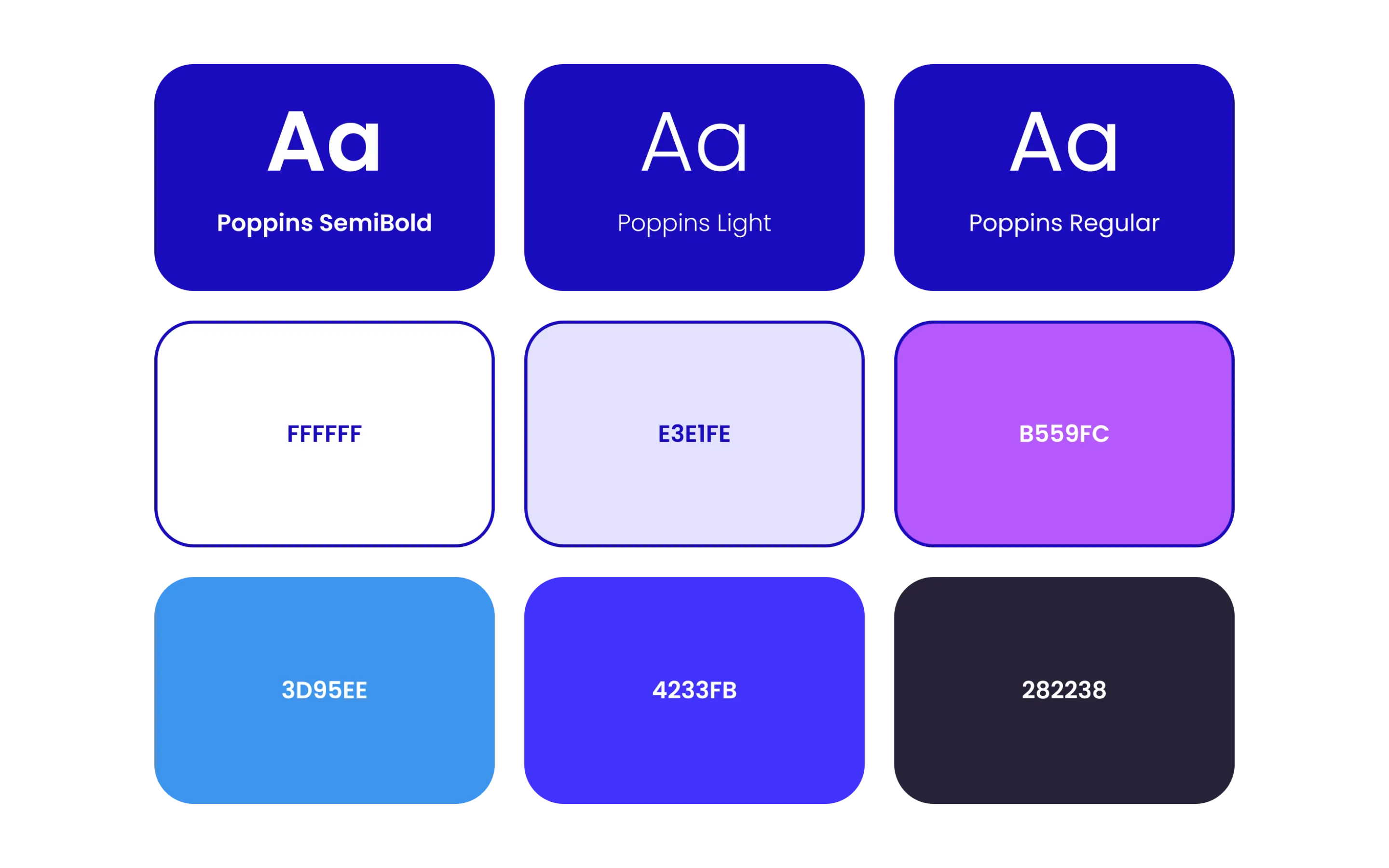
We set the type in Poppins. Its round letterforms match the logo. The palette runs from violet to blue, with a dark plum for contrast.
UI/UX design
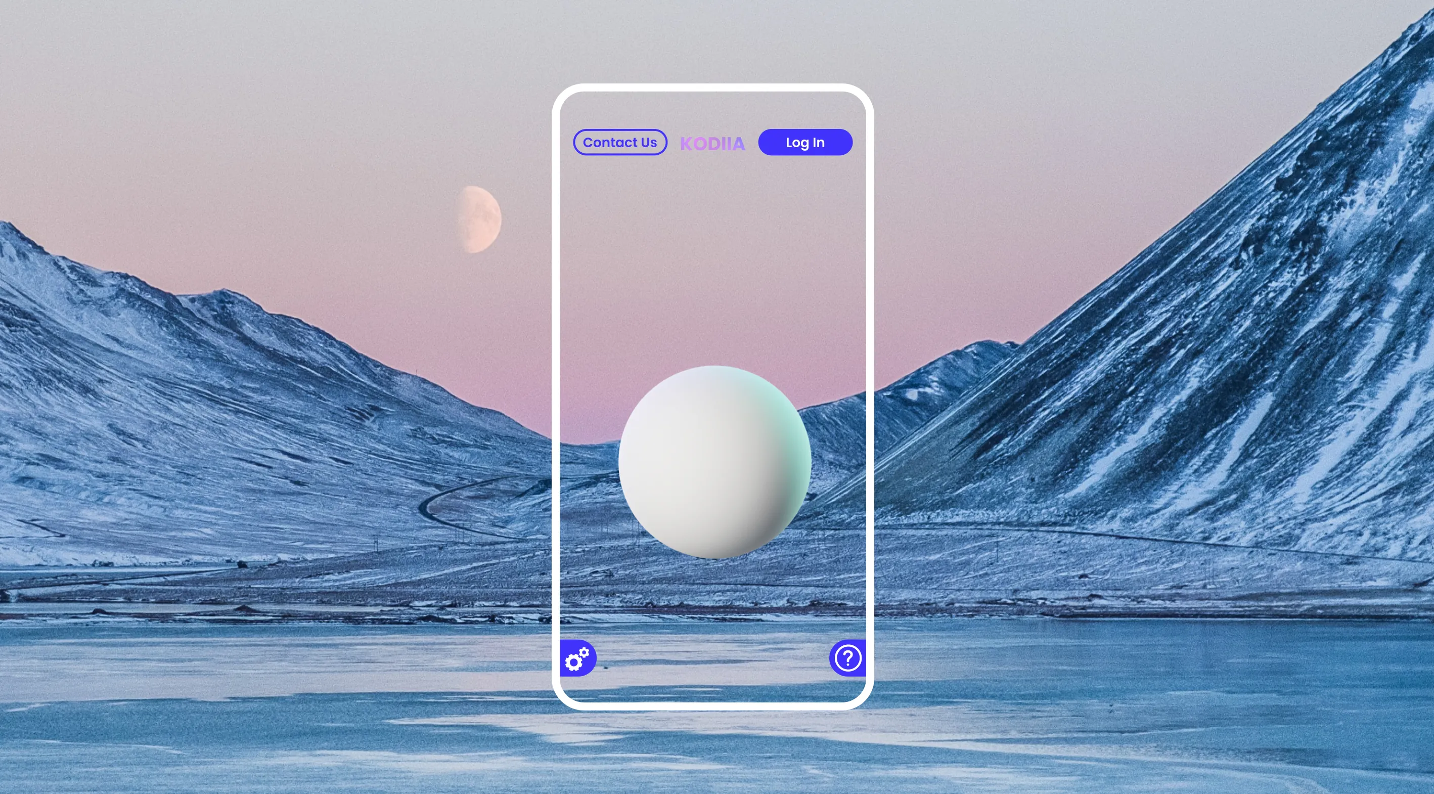
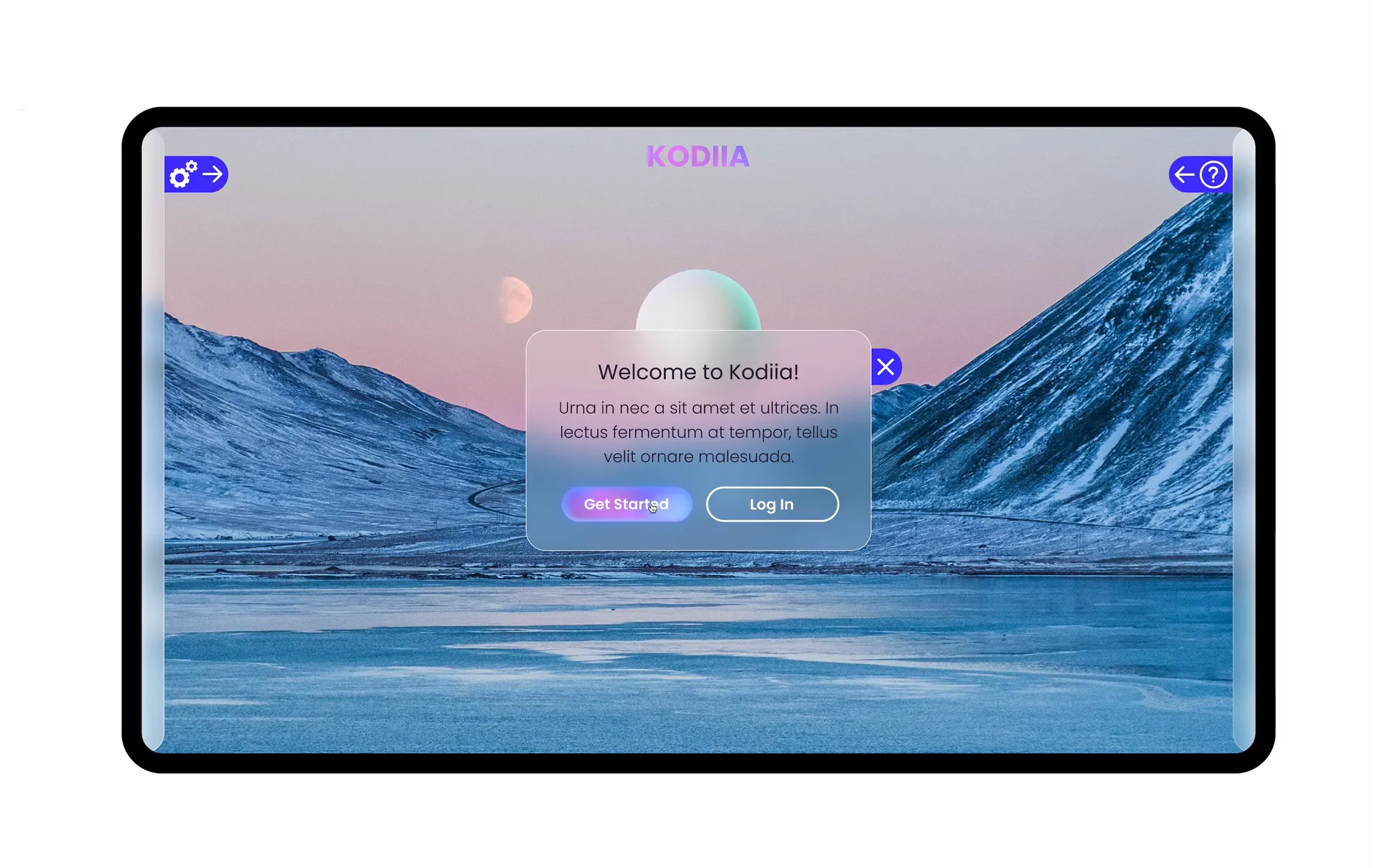
Every corner and button is rounded. Panels use frosted glass, which sits well over 3D objects.
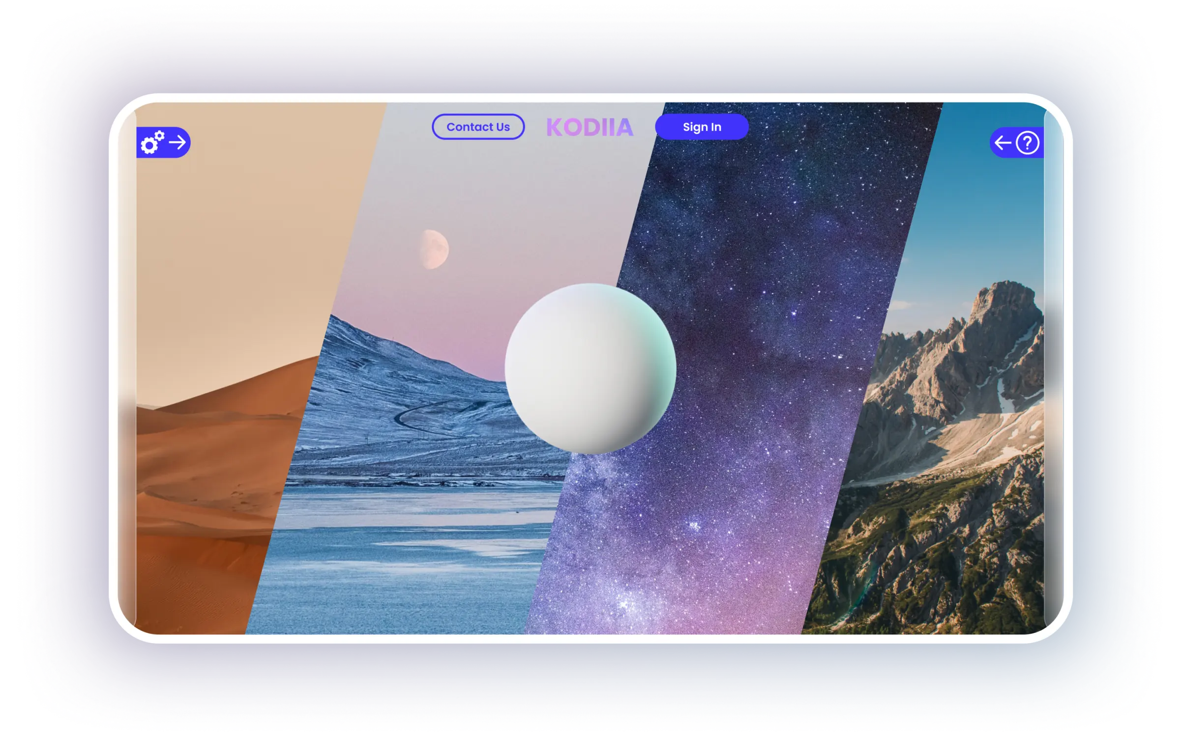
Users can change the scene behind their project, from space to a desert. Lessons and challenges guide them as they build.
Desktop and mobile
One goal was to let users hide every control and just play. The tools sit on side panels. A tap on the blue tag slides them out, and another tap hides them.
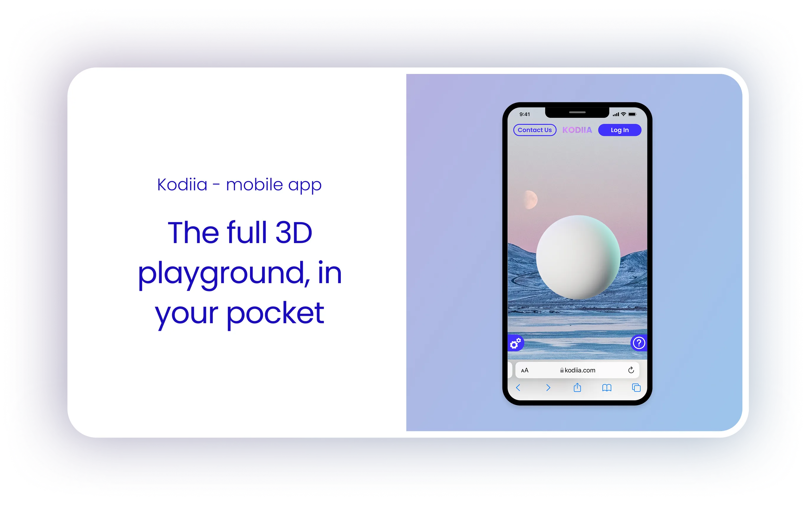
The mobile version uses the same panels, sized for a phone.
Got a website
to build?