All cases / Savocchi
2026
A premium brand and website for a 77-year-old window maker
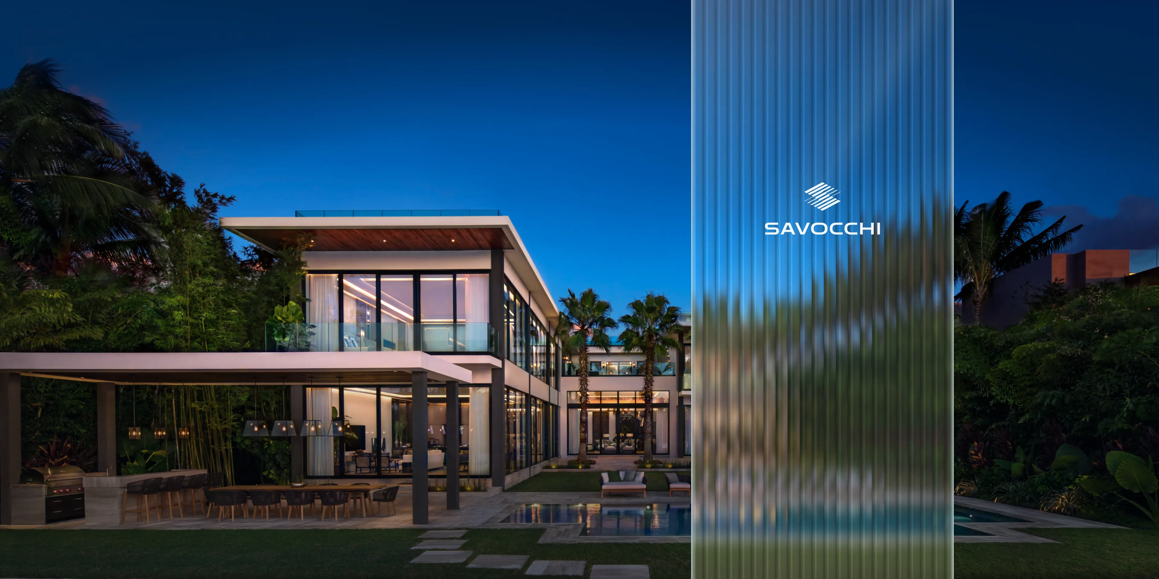
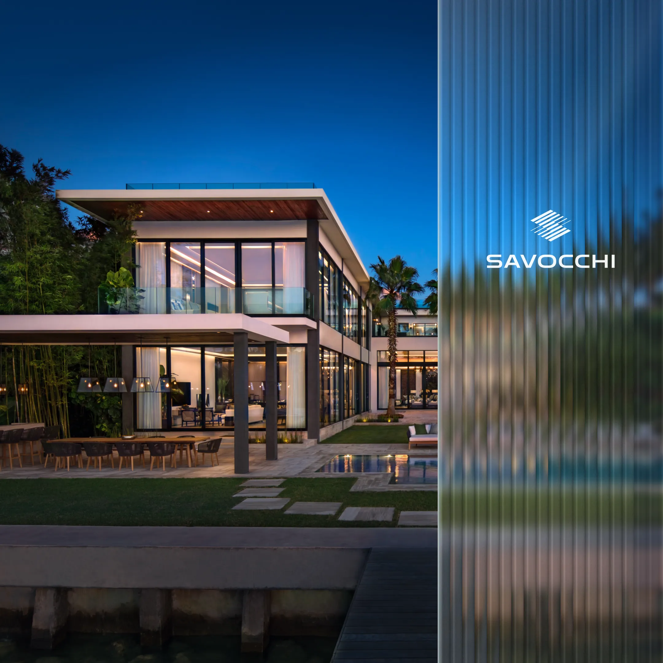
Savocchi started working with glass in 1949, first in Chicago and later in Miami. We handled the project end to end, from research and branding to design, build and launch.
Client
Savocchi
Industry
Windows, doors and glass
Year
2026
Timeline
3 months
Role
Research, branding, UX/UI design, Webflow, SEO
Live site
Visit siteHeritage and the goal
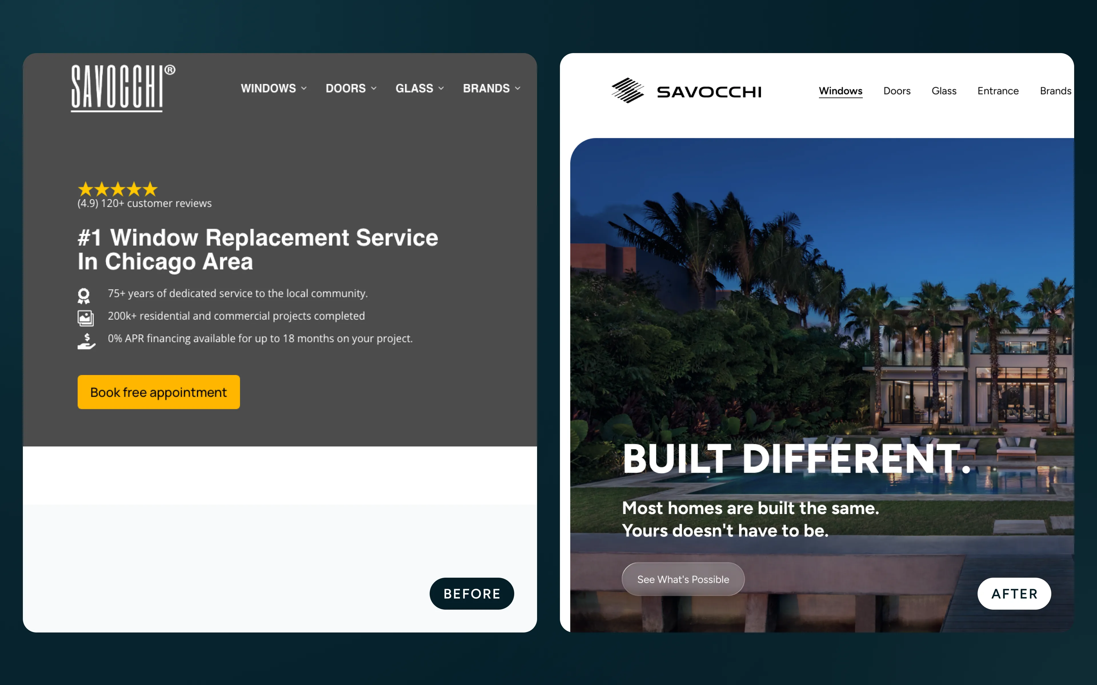
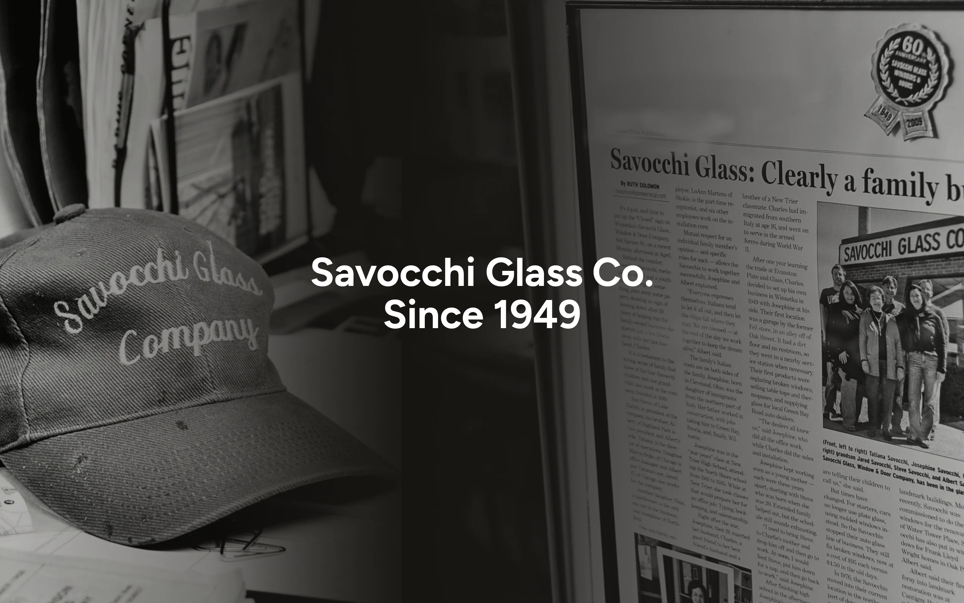
Savocchi began in 1949 as a family glass company in Winnetka, outside Chicago. Later, under its current owner, it grew into commercial glazing, and in 2024 it acquired Clear Choice Windows & Doors in Miami. By the time we met, it was one company working across Chicago, Miami, Palm Beach and the Caribbean, but online it still appeared as two separate businesses with two websites.
The goal was to bring both under the Savocchi name, with a brand and website that match the level of the homes the company works on. The site also had to serve every market equally, rather than read as a Miami or a Chicago company.
Research and positioning
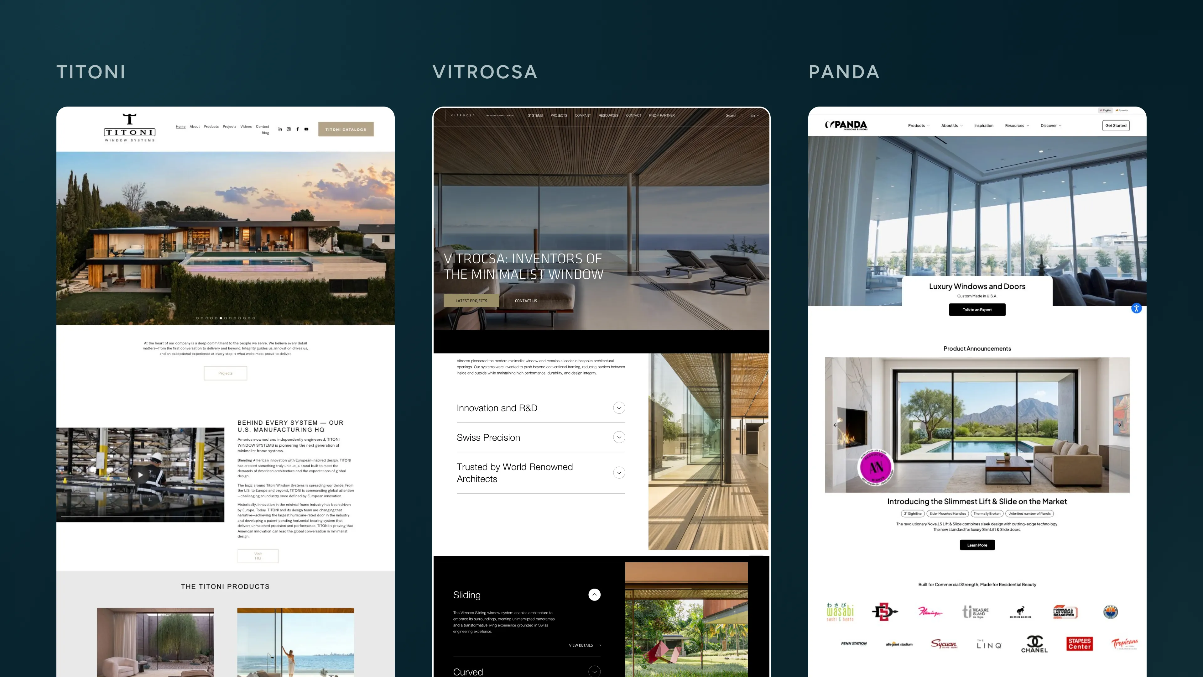
We started with a content audit of both existing sites and a study of eleven reference sites. The client’s picks, including Cornerstone, Titoni and Brodson, set the bar for how the brand should feel, with large photography, short copy and one idea per screen. Our own picks covered how it should work. Vitrocsa showed how to present projects as stories, and Panda how to keep service pages detailed but easy to read. Sky-Frame set the tone for a premium consultation request, and Folio Glass showed how a multi-brand installer can present itself as a curator.
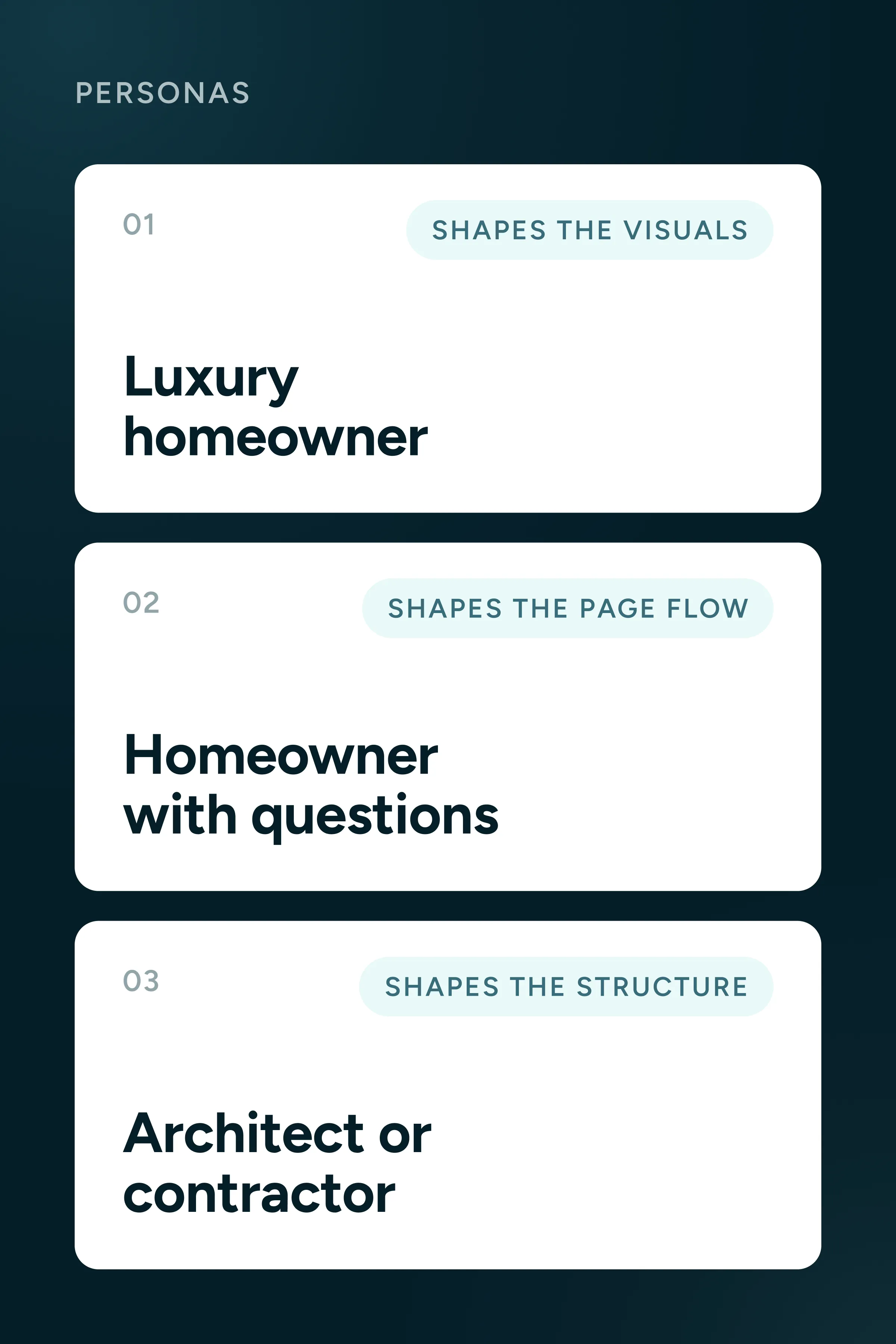
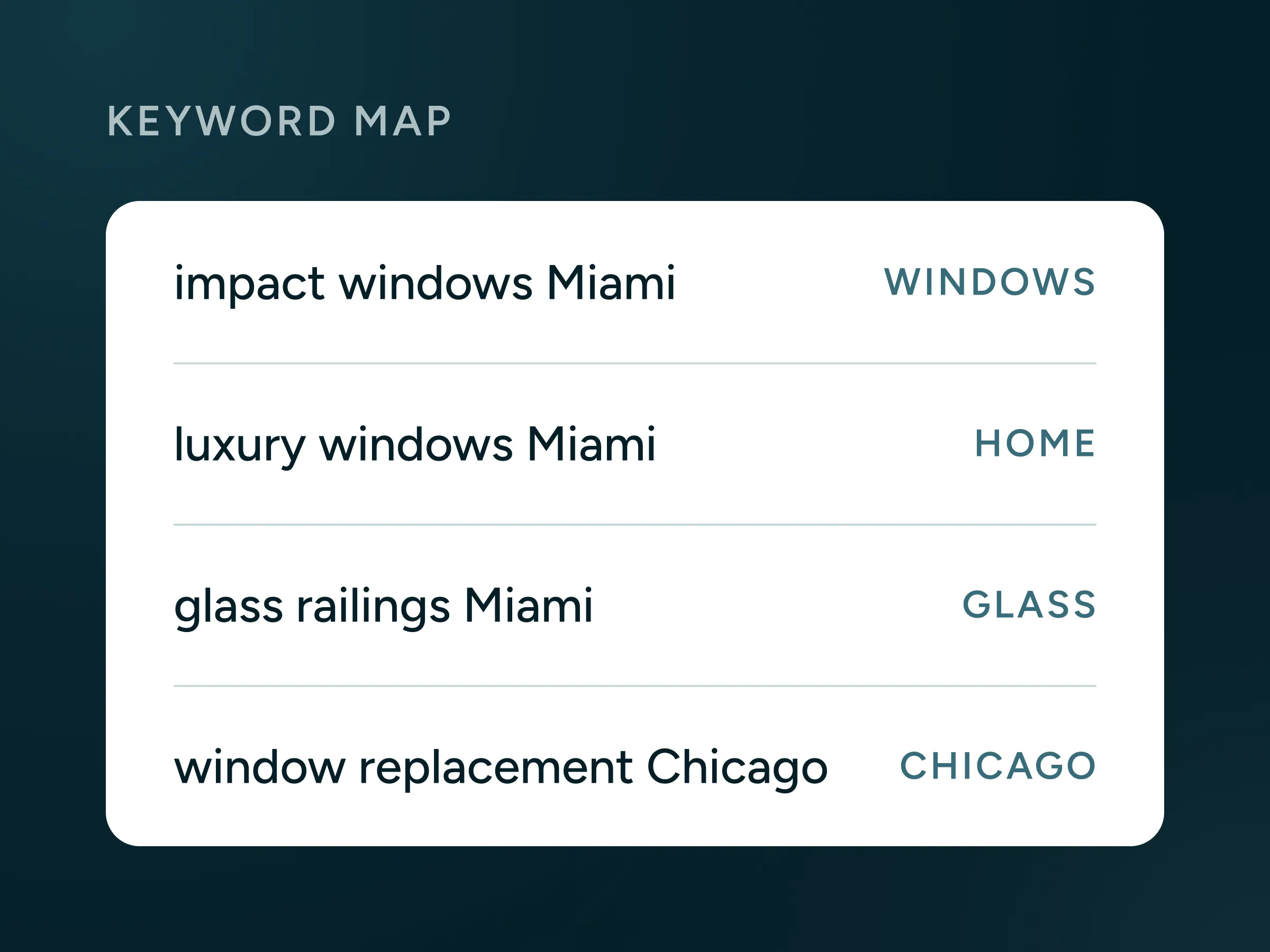
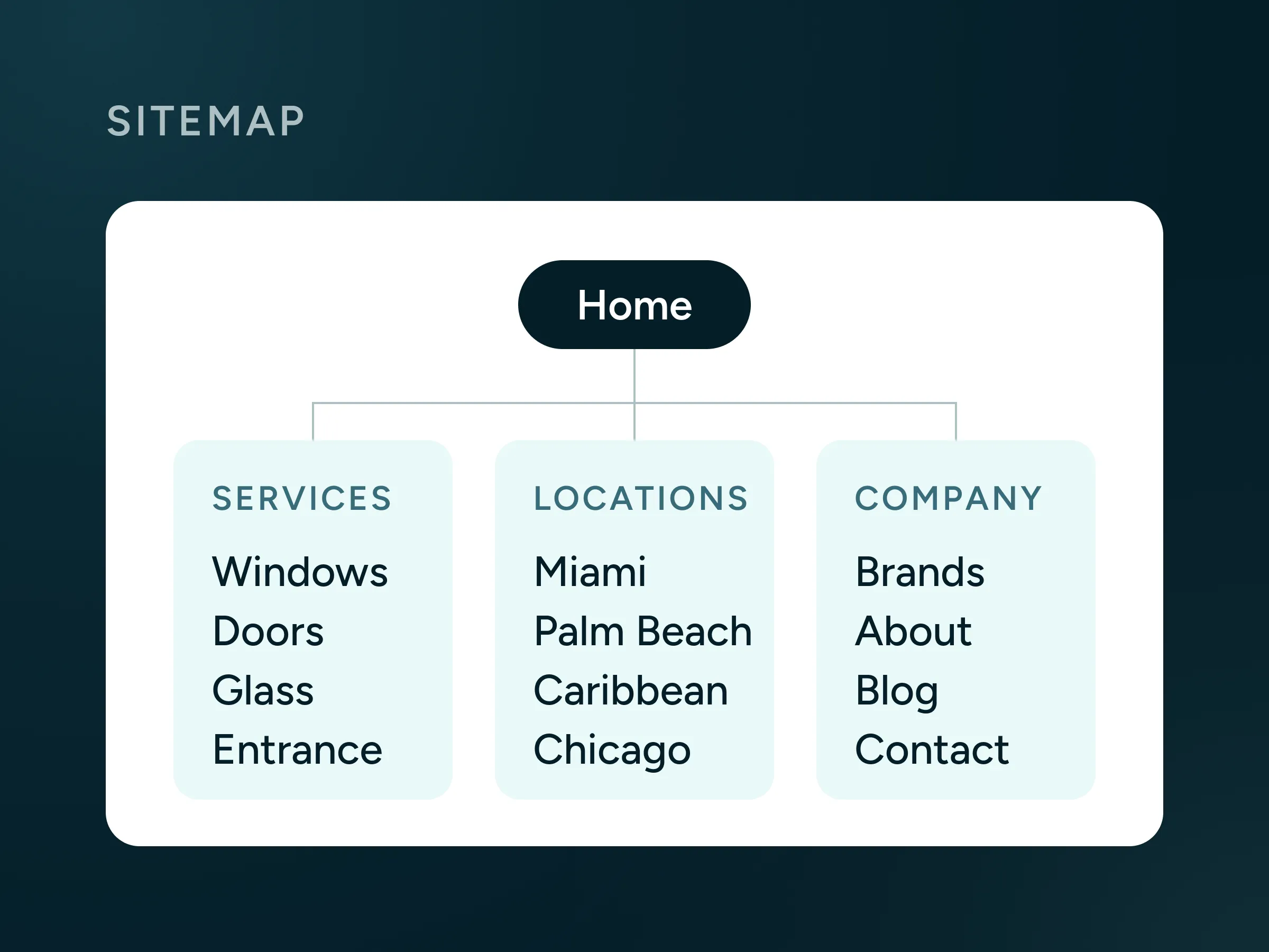
We developed three personas. The first is a luxury homeowner who decides on looks. The second is a homeowner who wants clear answers before committing. The third is an architect or contractor who needs products and brands in order. This let us shape the visuals for the first, the page flow and answers for the second, and the product and brand structure for the third. Where competitors like Cornerstone address architects, the new site would speak directly to homeowners. We then mapped 18 keyword groups onto a new sitemap, so every page had a clear purpose in search.
Branding
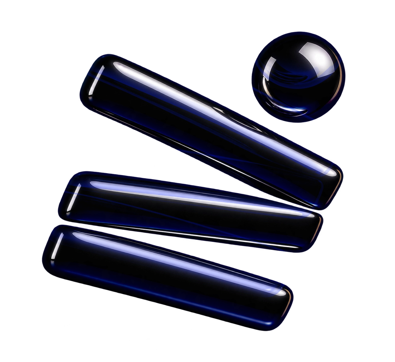
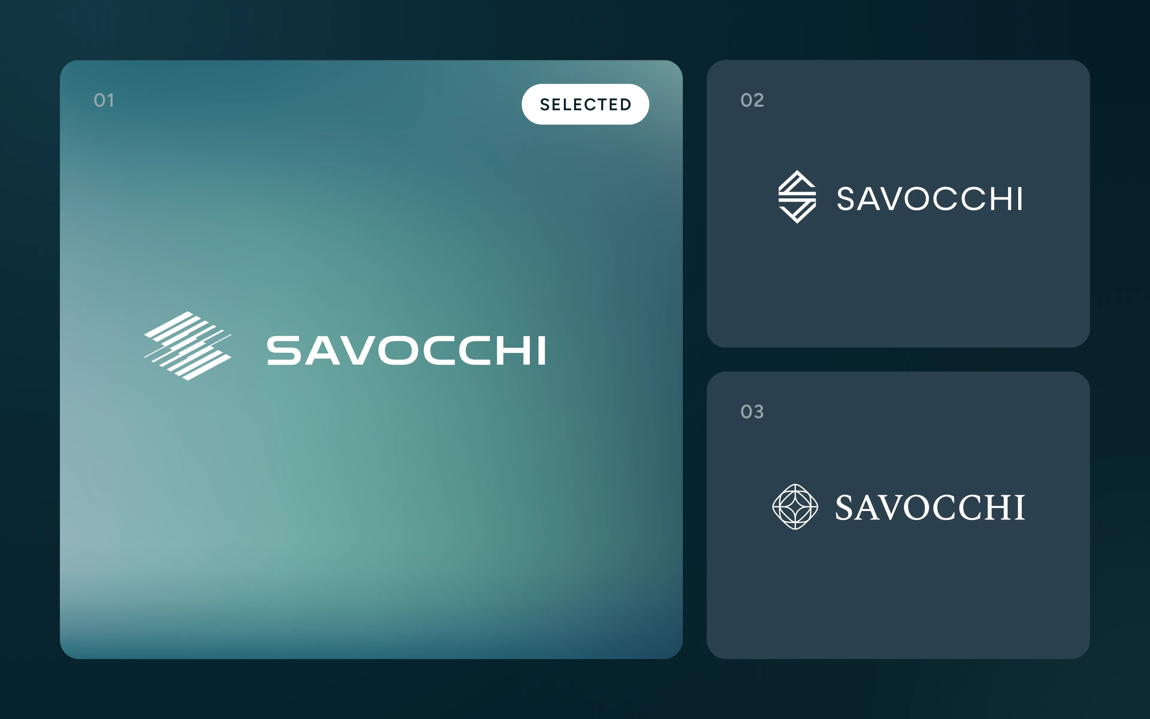
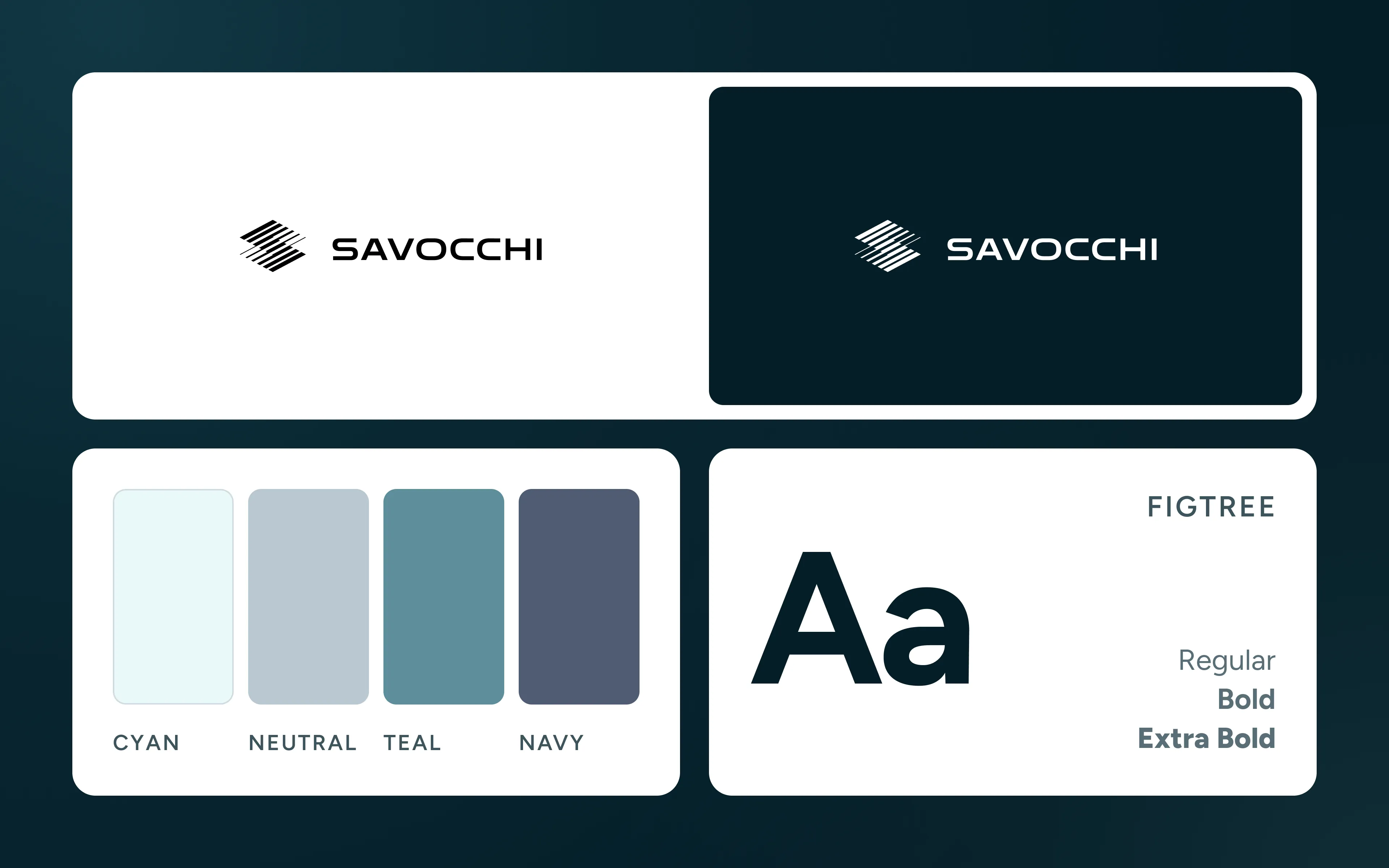
Three logo directions were developed. The first, an “S” built from parallel louvers, references window structures and the play of light, with bold type for stability. The second used sharp, interlocking lines that echo window frames, set in a lighter typeface. The third was a star-shaped emblem, a flash of light on glass, paired with a classic serif font. The louver “S” was selected.
The identity is built around light passing through glass. The accent colors, cyan, teal and navy, come from the tint seen on the edges of architectural glass, set against a high-contrast black and white base and a range of cool neutrals. Figtree was chosen for its geometric structure and readability, and carries everything from headlines to body text in a range of weights.
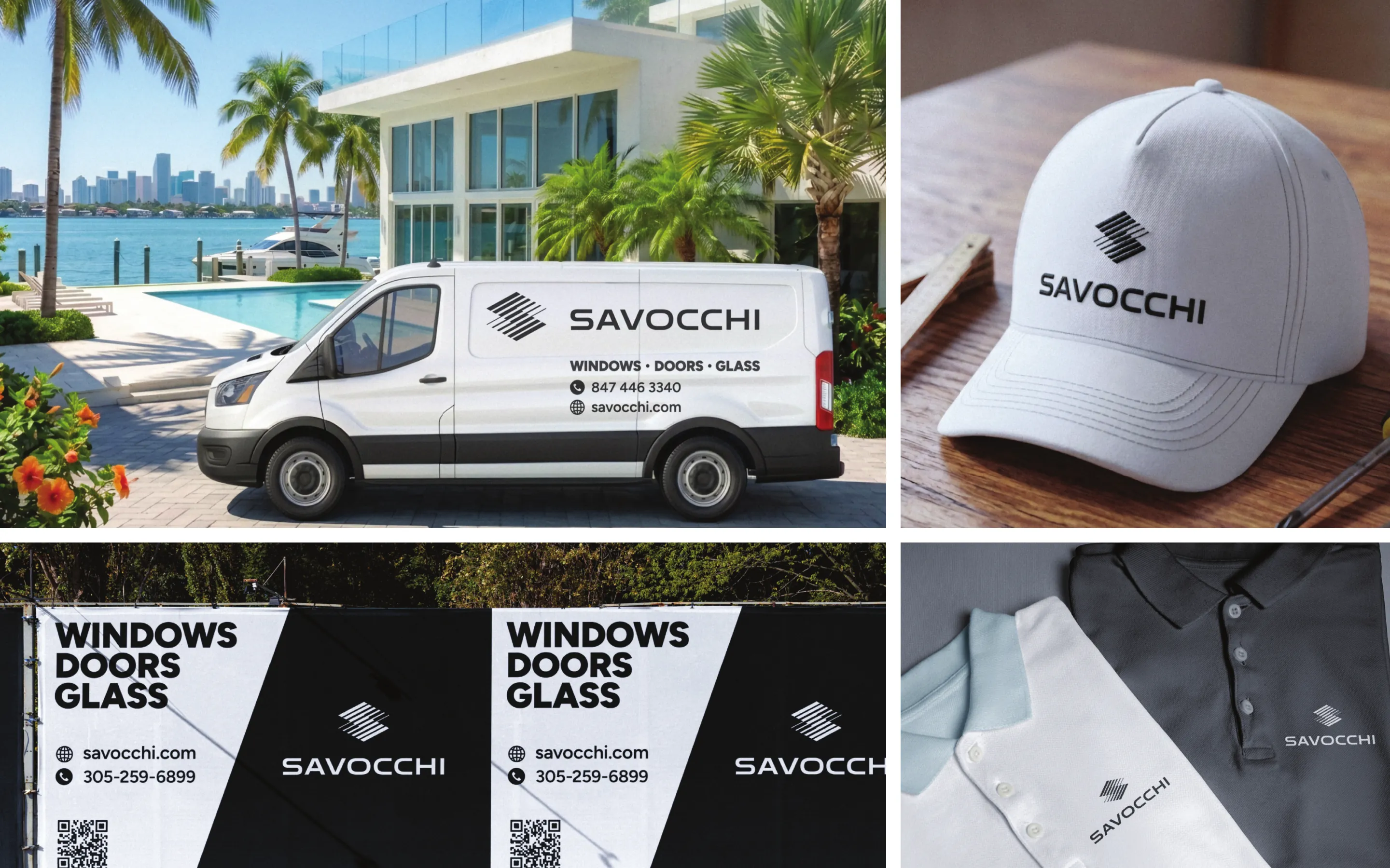
We also took the brand beyond the digital space, with a service van, construction fence banners, caps and polo shirts, each worked out in detailed mockups. All of it is documented in the brandbook, along with logo use, color and typography.
UX and UI design
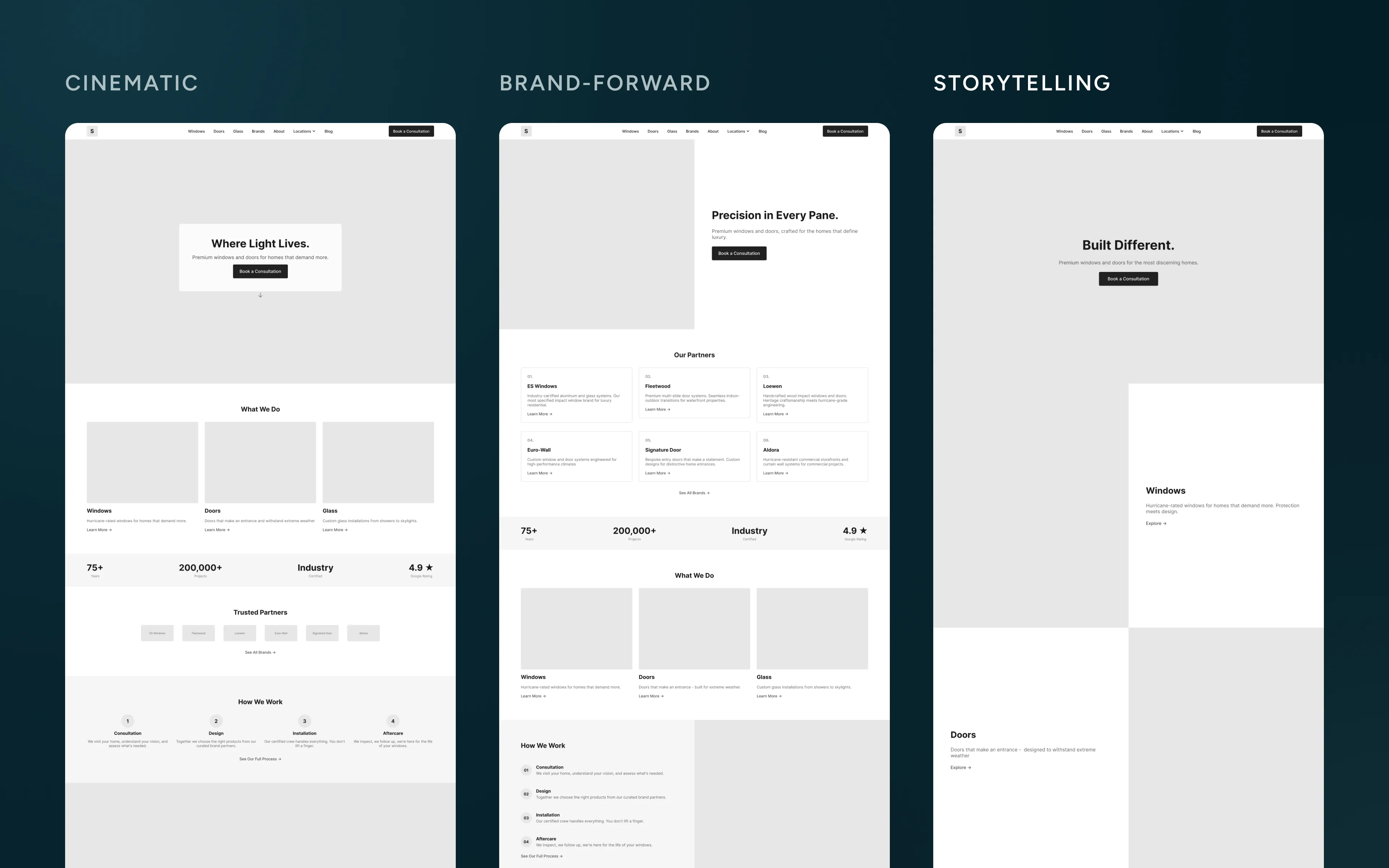
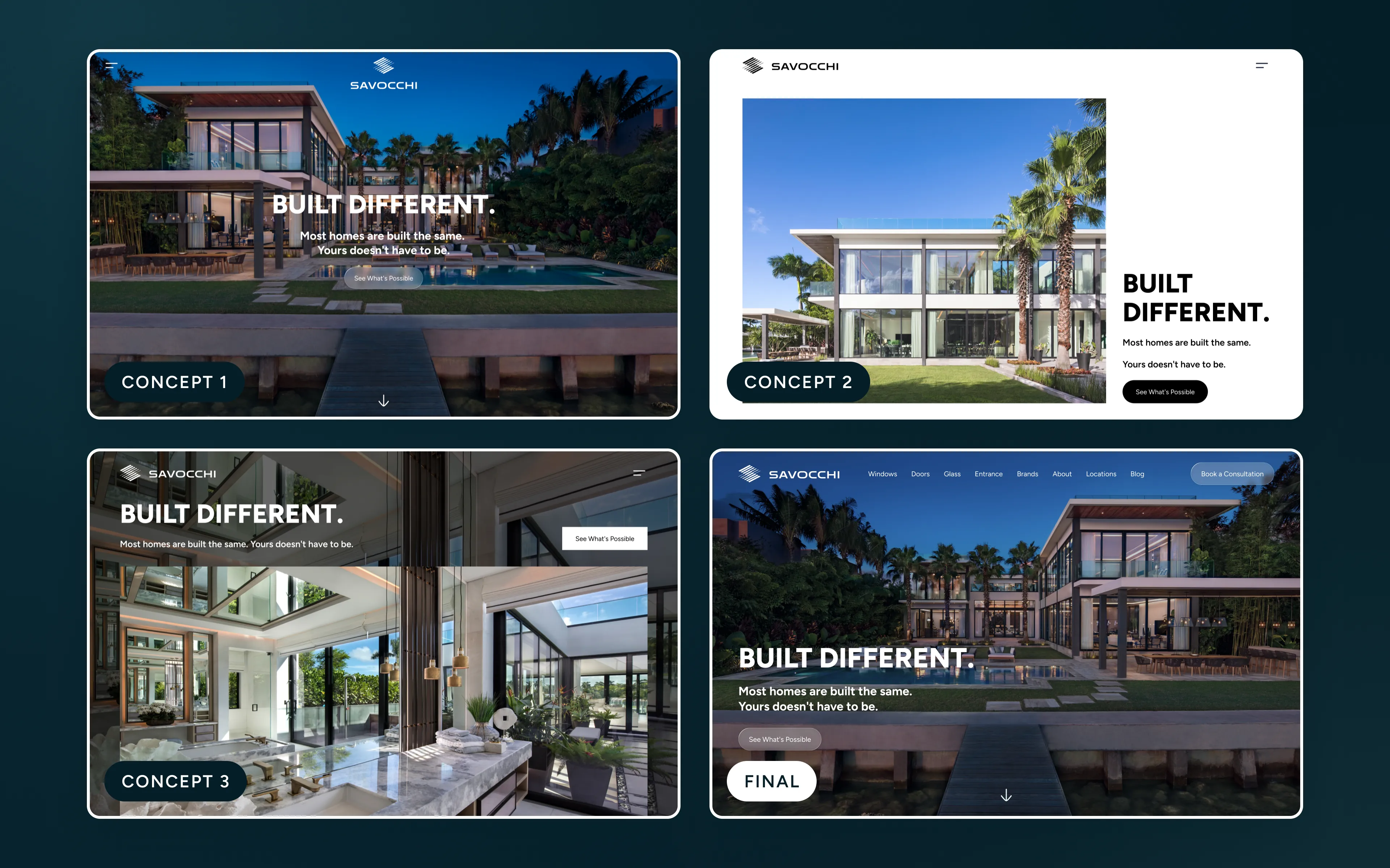
Three homepage wireframes were developed, each in a different direction: cinematic, brand-forward and storytelling. The storytelling direction was chosen, and we built three high-fidelity homepage designs from it. The client pointed out what he liked in each, we blended those parts into one design, then refined it after a final review.
The style is minimal. In the homepage hero, rounded shapes frame the photography like a window onto the kind of home Savocchi helps create, and subtle frosted-glass elements reference the windows, doors and glass the company installs.
With the homepage established, we created the design system. It covers a color palette in tonal steps, the Figtree type scale, spacing rules and a library of components, from navigation and cards to forms and FAQs.
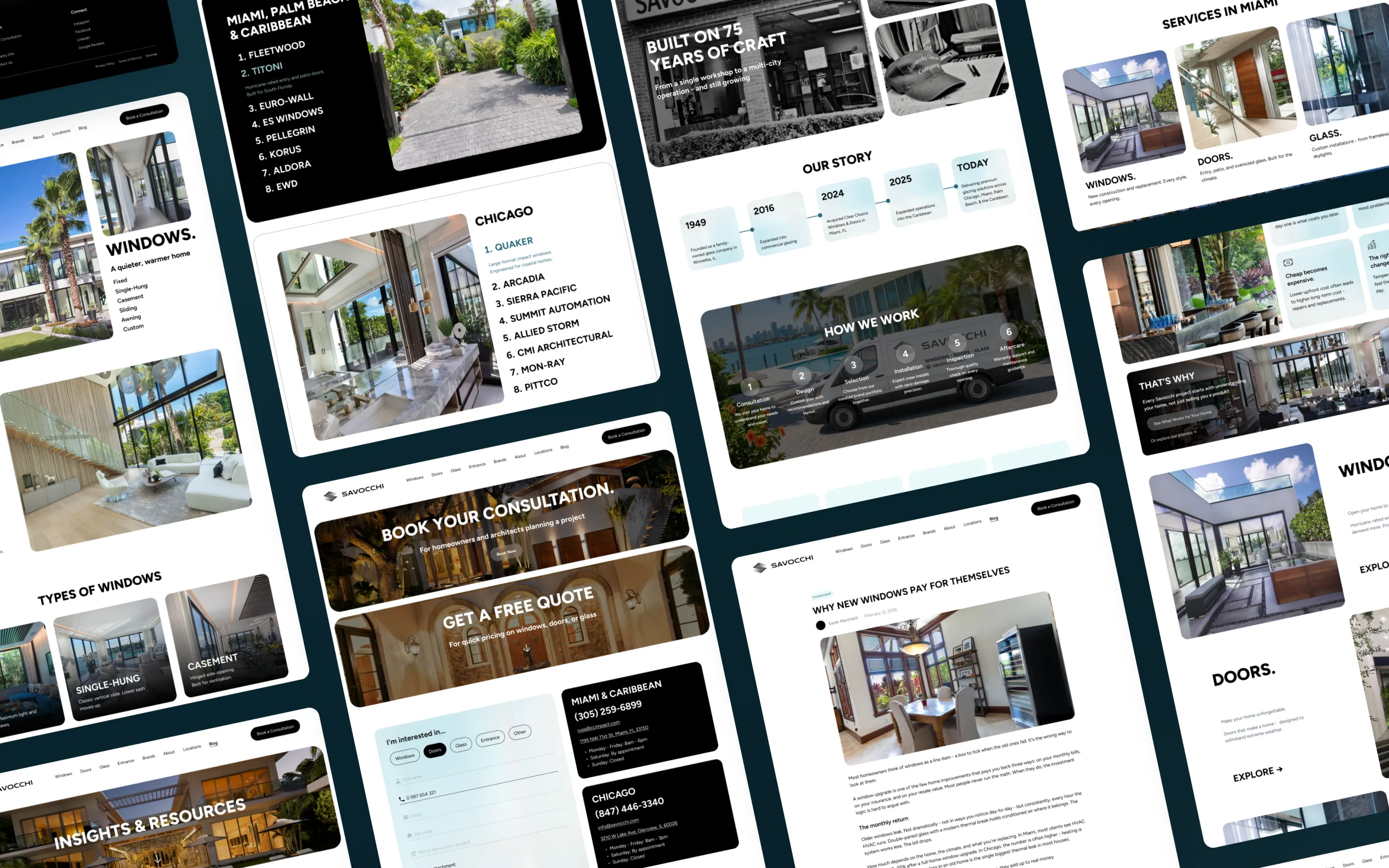
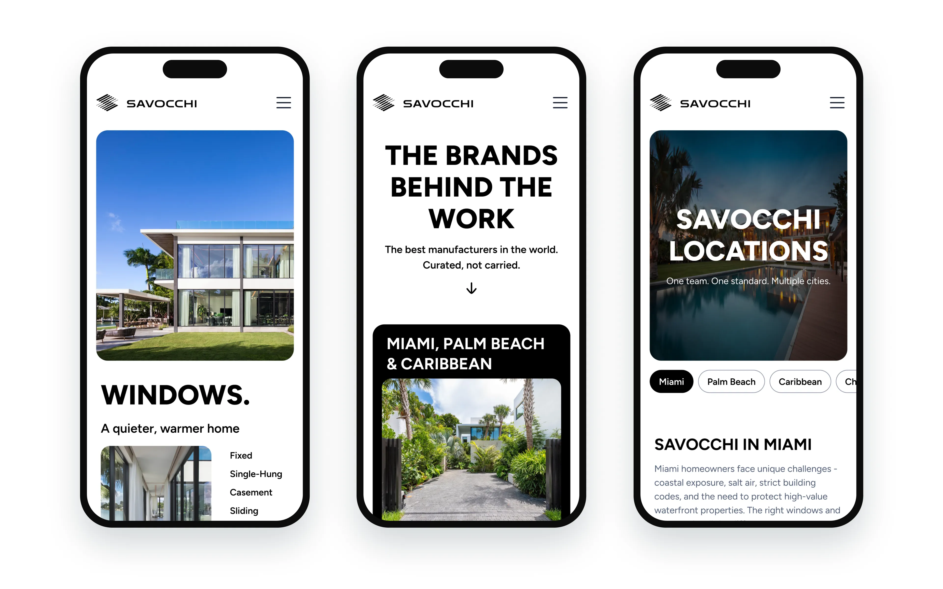
From there we designed the full site: the home page, four service pages for windows, doors, glass and entrances, a brands page, a location template for every market, about, contact and a blog with article pages. Each one is laid out for desktop, tablet and mobile.
Build and launch
The site was built in Webflow. It needs no plugins or updates, runs on managed hosting with built-in security, and stays fast on a global content delivery network.
We moved the design from Figma page by page and tuned every breakpoint so each layout holds on every device. The build follows the Client-First methodology, which keeps the structure clean and easy to extend. Motion was finished in the browser, with scroll reveals, a brand showcase that changes on hover and a project carousel.
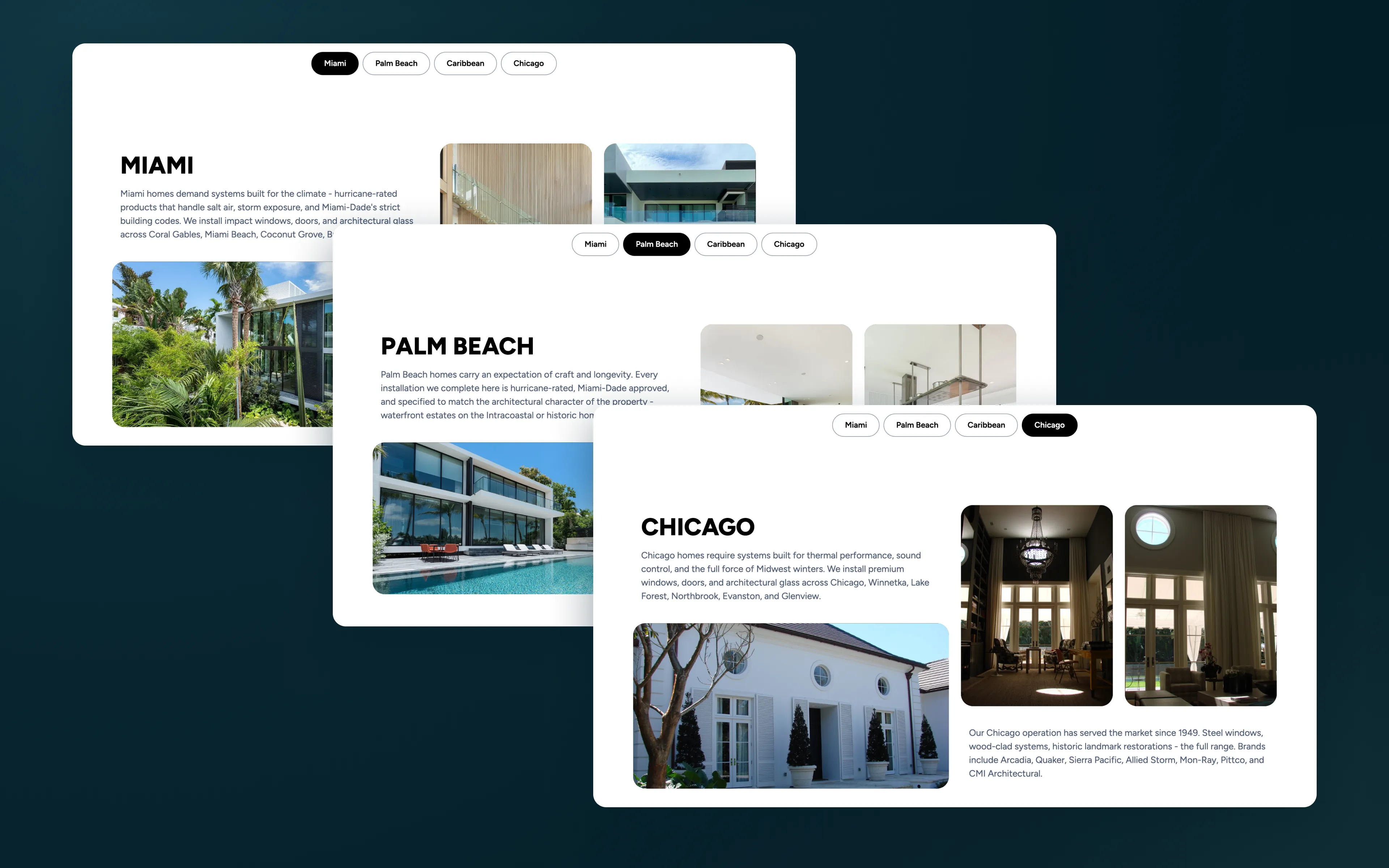
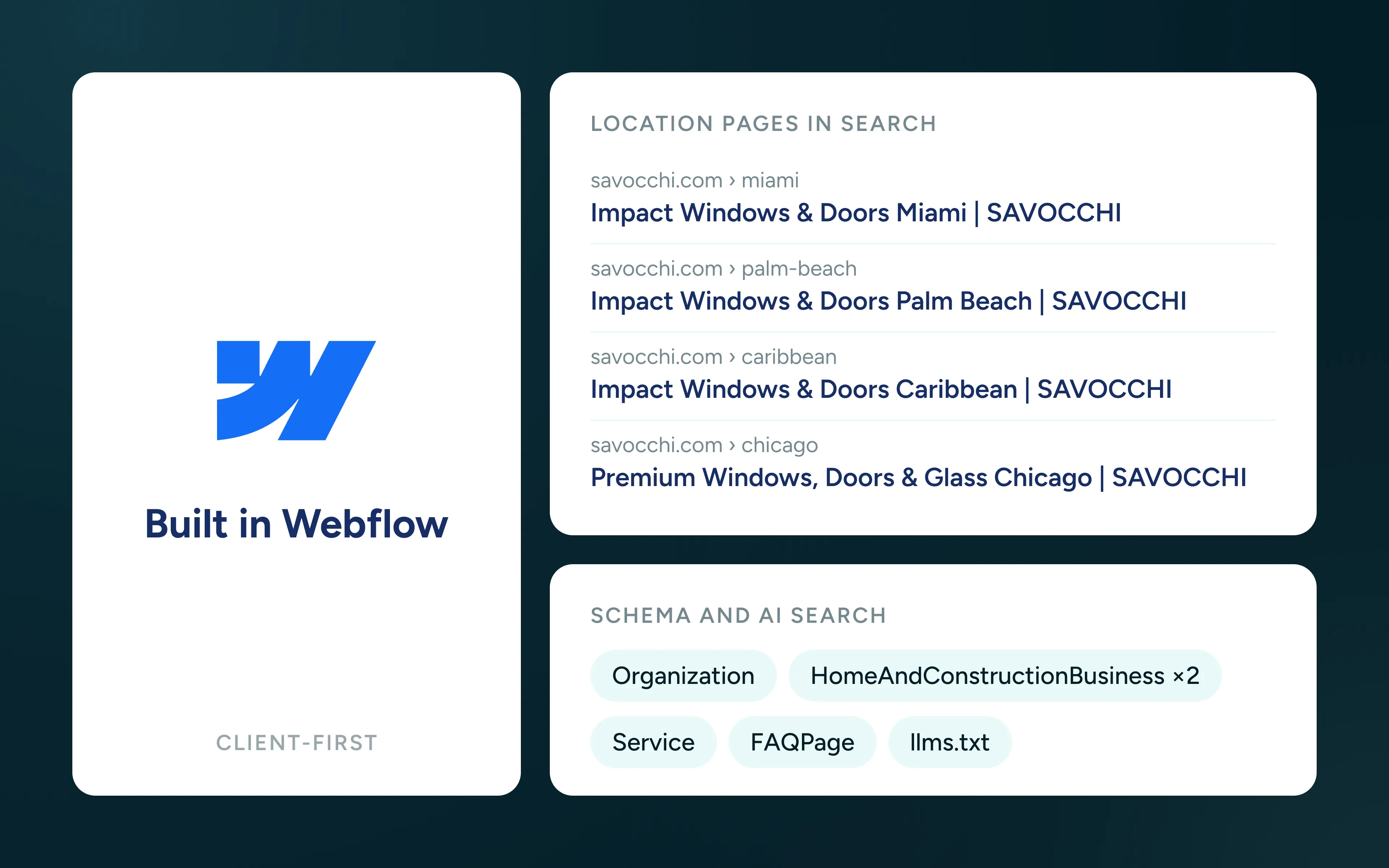
Each location has its own page, so Miami, Palm Beach, the Caribbean and Chicago can each be found in search on their own. Despite that, choosing a city swaps only the local content with a soft crossfade, without reloading the page, while each city keeps its own address.
Search visibility mattered as much as the look, so we took care of it before launch. We added structured data describing the company, both offices, every service and the FAQs, which helps the site appear in local map results and AI search. Every page has its own title and description, images carry descriptive alt text, and the site is open to AI crawlers with an llms.txt file. At launch we moved savocchi.com to the new site and redirected the old addresses of both previous websites.
Results
Live on savocchi.com since June 2026. An independent audit run by the client’s team scored the site 100 for SEO, accessibility and best practices.
100
SEO score
100
Accessibility score
2 into 1
Brands merged
Got a website
to build?